What is Exploratory Data Analysis?
We can define exploratory data analysis as the essential data investigation process before the formal analysis to spot patterns and anomalies, discover trends, and test hypotheses with summary statistics and visualizations. It gives an idea about the data we will be digging deep into while analyzing. It aids in formulating how we can handle data during analysis, like choosing models, handling outliers, deciding model accuracy parameters, etc. Visualization helps to infer insights easily from massive datasets.
Exploratory Data Analysis Example
Suppose you decide to go out for dinner on holiday in order to enjoy good quality food and a peaceful time with your family. What would you do? You would see how far you want to travel, what kind of cuisine you are craving, can you book a table so that you don’t have to wait, and of course the price range. So, based on these parameters, you will explore available options and finally pick the desired restaurant. This is nothing but exploratory data analysis. So, The only difference is, data scientists perform it on a much larger scale, with complicated parameters, statistical parameters, and much more.

Techcanvass also offers Certification In Business Data Analytics (CBDA) Training, In this program, you will have an endorsement of your ability to accomplish end-to-end business analytics initiatives using data for informed decision-making.
Let us look at some basic but popular visualizations that help in exploratory data analysis. Hence, The correct choice of visuals depends on the number of variables involved, the type of data (discrete or continuous), and the goal or type of inference required.
Types of Exploratory Data Analysis
Univariate Plots
Univariate plots show the frequency or the distribution shape of a variable.
Histograms
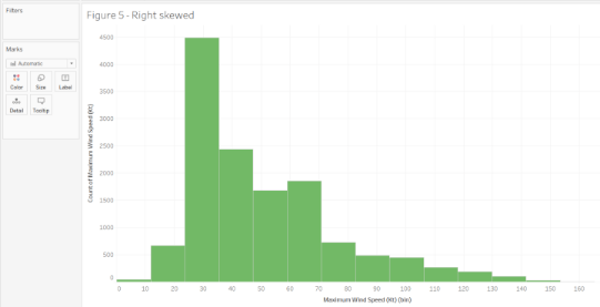
Histograms are two-dimensional plots in which the x-axis divide into a range of numerical bins or time intervals. The y-axis shows the frequency values, which are counts of occurrences of values for each bin. Bar graphs have gaps between the bars to indicate that they compare distinct groups, but there are no gaps in histograms. Hence, They tell us if the distribution is left/positively skew (most of the data falls to the right side), right/negatively skewed (most of the data falls to the left side), bi-modal (graphs having two distinct peaks), normal (perfectly symmetrical without skew), or uniform (almost all the bins have similar frequency).
For example, this histogram shows the maximum wind speed of all the hurricanes. Since, We can observe that most of the distribution is saturate on the left side between 30 – 40 Kt. This tells us that the maximum wind speeds are concentrate on the lower side, indicating that not many storms are severe.
Probability Distribution Plots
Probability distributions are mathematical functions that describe all the possible values that a random variable can assume within a given range. They help model random phenomena, allowing us in order to estimate the probability of a particular event. This type of distribution is helpful to know the likely outcomes and the spread of potential values.
For a single random variable, probability distributions can be divided into two types:
Types
- Discrete Probability Distributions for Discrete Variables: Also known as probability mass functions, the random variable can assume a discrete number of values like the number of reviews; it can be 100 or 101, but nothing in between. It returns probabilities; hence the output is between 0 and 1. There are a variety of discrete probability distributions that you can use to model different types of data.
Let us look at the binomial distribution. So, There are two possible outcomes in this distribution – success or failure, and multiple trials are carried out. The probability of success and failure is the same for all trials. The sum of all probabilities must equal one.
Success Probability
So, let’s say that there is a success probability of 0.8 of manufacturing a perfect car engine part. What is the probability of having seven successes in 10 attempts? The probability of success is 0.8, and failure is 0.2. The number of trials is ten, and the number of successes is 7. The figure shows the probability of success (getting the perfect engine part 0 times, one time, two times, and so on). From the graph, we can conclude that the probability of seven successes in 10 attempts is around 0.20.
- Probability Density Functions for Continuous Variables: Also known as probability density functions, the random variable can assume an infinite number of values between any two values; like weight can take any value like 45.3, 45.36. 45.369, or 45.3698, and so on.
Probabilities for continuous distributions are measured over ranges of values rather than single points. A probability indicates the likelihood that a value will fall within an interval. The entire area under the distribution curve equals 1. For instance, the proportion of the area under the curve that falls within a range of values along the X-axis is the likelihood that a value will fall within that range.
Suppose we have a dataset of adults’ heights in a town, and the data follows a normal distribution. The mean equals 5.5, and the standard deviation is 1. The shaded area shows the probability that a randomly picked person’s height will be smaller than 4.5 ft and is approximately equal to 0.15 or 15%.
Run Sequence Plots
A run chart, also known as a run-sequence plot, displays observed data in a time sequence. So, Often, the data displayed represents some aspect of a business process’s output or performance. It is, therefore, a form of a line chart. They are often analyzed in order to locate anomalies in data that suggest shifts in a process over time. Changes in location and scale and outliers can easily be detected.
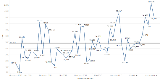
The graph shows how the sales vary across months and years with the average displayed by a line.
Useful Links – CBDA Training | Data Analytics Training | Data Visualization and Why It Is Important
Bivariate Plots
Bivariate plots display the relationship between two variables in exploratory data analysis.
Bar Graphs
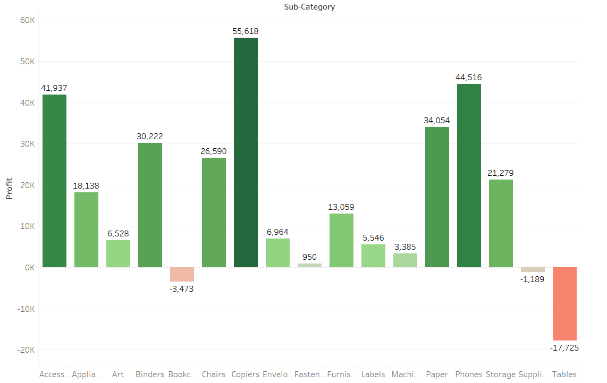
Bar charts can be used to compare nominal or ordinal data. They are helpful for recognizing trends.
Scatter Plots
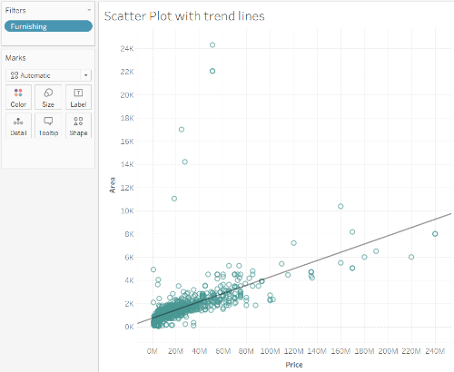
Scatter plots are commonly used in statistical analysis in order to visualize numerical relationships. So, They are use in order to determine whether two measures are correlate by plotting them on the x and y-axis. They are suitable for recognizing trends.
For instance, you can see a scatter plot of two measures in the figure – the house’s area against price and the trend line. The data points are concentrated in the lower price and lower area range. A few outliers are indicating larger area houses available for lower prices.
Box Plots
These charts show the distribution of values along an axis. Rectangular boxes are used in order to bucket the data, giving us an idea of how the data points are spread out. These boxes are also called quartiles which represent a quarter of a data set. Boxes can be drawn vertically or horizontally. We can also easily spot the outliers, which are usually treat as abnormal values and affect the data set’s overall observation due to their very high or low values.
Box plots are suitable for identifying outliers. The below figure shows the structure of a box plot.

Box Plot Data Summary
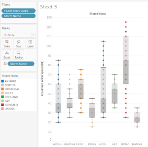
For instance, this example shows the maximum wind speed of different hurricanes with their names that occurred in 2014. We can conclude that Gonzalo has a median of 85, which is the highest as compare to other storms. Hence, This indicates that this was the strongest hurricanes in 2014; Edouard has the maximum spread of data points in Q3, Bertha has some outliers which need to be investigated.
This gives us quite a few ideas about storms in 2014.
Correlation Plots (Heat Maps)
For instance, correlation heat maps show the interrelationship between variables—areas as shaded as per the data’s values. So, Color differences can easily spot similar and different values and make sense of the data variation. They are usually helpful when you have a large amount of data. They are used during A/B testing to see which parts of a web page are accessed by users on a website. The number of reviews generated every hour, or to analyze a cricket match to understand where a batsman is scoring the bulk of his runs or where the bowler is pitching his ball.
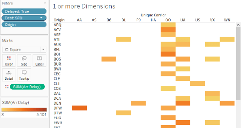
We can see that the arrival delay in SFO is maximum from Chicago O’Hare (ORD) origin. Delta(UA) and Sky West (OO) carriers have maximum arrival delays to SFO from different origins than other carriers.
Special Purpose Plots
Pair Plots
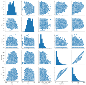
Pair plots are a simple way in order to visualize relationships between multiple variables. So, It produces a matrix of relationships between variables in the data for a direct examination of the data.
This plot shows how registered and casual users are using bike rentals. It also shows the effect of temperature, humidity, and wind speed on bike rentals. This gives you an overview of the correlation between multiple variables.
Contour Plots
The contour plot can be use for representing a 3D surface in a 2D format. Contour plots are generally use for continuous variables rather than categorical data.
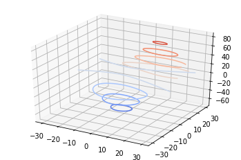
The Contour maps are inspired by seismic data analysis. They can explain where the data density is high, explore deep learning error functions or gradient analysis.
Useful Links – CBDA Training | Data Analytics Training | Data Visualization and Why It Is Important
Density Plots
A density plot is a smoothed, continuous version of a histogram estimated from the data. The most common form of estimation is the kernel density plot. In this method, a continuous curve (the kernel) is drawn at every individual data point. All of these curves are then combine to make a single smooth density estimation.
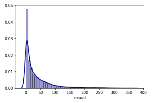
So, The y-axis in a density plot is the probability density function for the kernel density estimation and not a probability. The difference is that the probability density is the probability per unit on the x-axis.
While comparing the distributions of one variable across multiple categories, histograms have issues with readability. Density plots are useful in this scenario.
Spider/Radar Charts
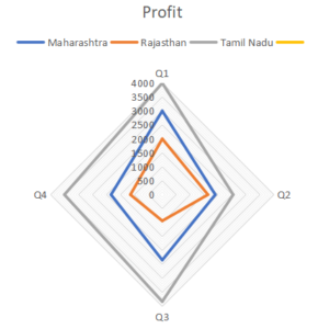
A spider chart is a graphical way of displaying multivariate data of three or more quantitative variables represented on axes starting from the same point. It helps demonstrate a dominant variable.
This spider/radar chart is showing the variation in profit for each state across quarters. We can see the steepest drop in profits for Tamil Nadu from Q1 to Q2.
Lag Plots
A relationship between an observation and the previous observation is beneficial in time series modeling. Previous observations in a time series are lags, with the observation at one previous time step. It is known as lag1, the observation at two previous steps lag2, and so on.
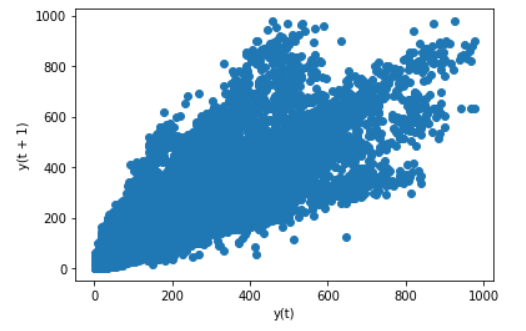
A lag plot is a useful type of plot in order to explore each observation’s relationship, and a lag of that observation and is display as a scatter plot. If the points cluster along a diagonal line from the bottom-left to the plot’s top-right, it suggests a positive correlation relationship. If the points cluster along a diagonal line from the top-left to the bottom-right, it means a negative correlation relationship.
Lag plots can help compare observations simultaneously in the last week or last month, or the previous year by using corresponding lag values.
The plot here shows the count of bike rentals compared to the previous day’s count, and it displays a relatively strong positive correlation.
Auto-Correlation Plots
The correlation between observations and their lag values in a time series name autocorrelation. Correlation coefficients are plotted on an autocorrelation plot.
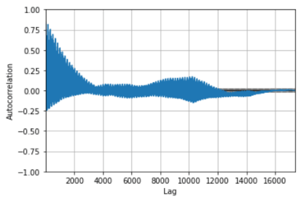
A correlation coefficient is a correlation value between observations and their lag1 values and results in a number between -1 and +1. A value close to zero suggests a weak correlation, whereas a value closer to -1 or 1 indicates a strong correlation. It helps better understand how this relationship changes over the lag. It shows the lag on the x-axis and the correlation on the y-axis.
In the graph, we can see a strong positive correlation of the count of bike rentals.
Lognormal Plots
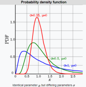
A normal distribution can convert to a lognormal distribution using logarithmic mathematics. The lognormal distribution plots the log of random variables from a normal distribution curve. It displays the probability density function (pdf) and is of particular interest when the variable must be positive as log values are always positive.
Many examples follow lognormal distribution like the concentration of elements and their radioactivity in the Earth’s crust, latent periods of infectious diseases, the distribution of particles, chemicals, and organisms in the environment, the length of comments posted on social media website discussion forums, or fluctuations in the stock markets.
Conclusion
Exploratory Data Analysis is just a key in order to have a better understanding and representing your data, which helps you build a stronger, more generalized model. So, The visualization of the data is easy to achieve, which facilitates the comprehension of our analysis by others.
You can also find out more about Data Visualization and Why It Is Important in data science and data analytics, visit our Blogs to access more articles.


