6 Types of Bar Charts and Bar Graphs: A Complete Guide
Picking the wrong bar chart is one of the most common visualization mistakes in business reporting. This guide walks through all six types with real BA examples, so you can match the chart to the data instead of guessing.
- Know exactly which of the 6 bar chart types fits your dataset, not just the one you default to
- Avoid the axis and proportion mistakes that quietly mislead stakeholders
- Ready BA examples for requirements tracking, KPI dashboards, and risk reporting
- A bookmarkable comparison table for fast tool and chart-type selection
There are six main types of bar charts used in data visualization and business reporting: the basic bar chart, grouped (clustered) bar chart, stacked bar chart, 100% stacked bar chart, horizontal bar chart, and bar-and-line combo chart. A bar chart, also called a bar graph, uses rectangular bars to compare values across categories. Which of the six you reach for depends entirely on whether you’re comparing one series, several series side by side, or showing how a total breaks down into parts.
| Key Facts | Details |
|---|---|
| Also known as | Bar graph, bar diagram, column chart (vertical variant) |
| Number of main types | 6 (basic, grouped, stacked, 100% stacked, horizontal, combo) |
| Best used for | Comparing values across categories or tracking change over a small number of discrete periods |
| Data type required | Categorical (nominal or ordinal) paired with numerical values |
| Common tools | Microsoft Excel, Power BI, Tableau, Google Sheets, Python (matplotlib) |
| BA relevance | Requirements reports, KPI dashboards, stakeholder presentations, process analysis |
The 6 Types of Bar Charts at a Glance
What Is a Bar Chart?
A bar chart is a data visualization that uses rectangular bars to represent categorical values, where the length of each bar is directly proportional to the number it stands for. That proportionality is really the whole trick. Instead of asking someone to read a column of numbers and mentally rank them, a bar chart lets the eye do the ranking instantly.
Every bar chart runs on two axes. The category axis, usually horizontal, lists what you’re comparing, product names, months, departments, whatever the grouping variable happens to be. The value axis, usually vertical, shows the measurement. Flip a chart on its side into a horizontal bar chart and those two axes simply swap places.
Bar charts have been around for a long time, and there’s a reason they’ve outlasted plenty of flashier chart types: they’re immediately legible to almost anyone, technical or not. A dense table of numbers takes work to interpret. A well-built bar chart communicates the same comparison in about two seconds.
Bar Chart vs Bar Graph: Is There a Difference?
Functionally, no. “Bar chart” and “bar graph” describe the exact same visualization, rectangular bars representing comparable values. Where they genuinely differ is in who uses which term, and in what setting.
| Aspect | “Bar Chart” (General / British) | “Bar Graph” (Academic / US / Asian) |
|---|---|---|
| Common in | British English and professional BI/data visualization contexts | American English, particularly school and university statistics curricula |
| Typical setting | Business reports, dashboards, corporate presentations | Textbooks, exam papers, early data-literacy education |
| Who tends to say it | Business analysts, data analysts, BI developers | Students, teachers, academic statisticians |
| Tool labeling | Software menus (Excel, Power BI, Tableau) almost always say “bar chart” | Rarely a menu label; mostly encountered as a teaching term |
| Regional overlap | Increasingly the default in professional settings worldwide | Still common in South Asian and American school systems, sometimes as “bar diagram” |
In practice, you’ll see both terms used interchangeably, sometimes in the same document. If you learned the term “bar graph” in school and now see “bar chart” in Power BI or Excel, you haven’t stumbled onto a different tool. It’s the same chart, just a different regional habit of naming it.
When Should You Use a Bar Chart?
A bar chart earns its place when:
- You need to compare values across distinct categories, sales by region, revenue by product line.
- You’re tracking how one category changed across a small number of discrete time periods.
- You need to rank items by size, a bar chart makes the biggest and smallest instantly obvious.
- Your audience is non-technical. Few chart types are as universally readable.
A bar chart is the wrong choice when:
- You have continuous data across many time periods, a line chart handles that better.
- You want to show how parts make up a whole as a proportion of one single total, a pie chart or a 100% stacked bar does that job more cleanly.
- You’re dealing with more than 15 to 20 categories, at that point a table or a dot plot reads better than a wall of bars.
6 Types of Bar Charts and Bar Graphs (With Examples)
Here’s each of the six, what it’s built for, and where a business analyst would actually reach for it.
1. Basic (Simple) Bar Chart
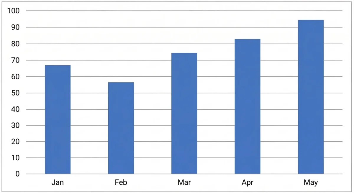
The basic bar chart, often called the Simple Bar Chart, is the version most people picture the moment someone says “bar chart.” It plots a single data series across your categories, one bar per category, and the bar’s height is the value, full stop. There’s no second series to track and no segment to decode.
A Simple Bar Chart is exactly where you should start when you’re comparing just one measure across categories, monthly defect counts, sales by country, page visits by month. It’s the least likely chart type to confuse a stakeholder, which is precisely why it stays the default choice.
| Feature | Detail |
|---|---|
| Data series | One |
| Best for | Simple category comparison |
| Business example | Monthly defect counts in a testing cycle |
2. Grouped (Clustered) Bar Chart
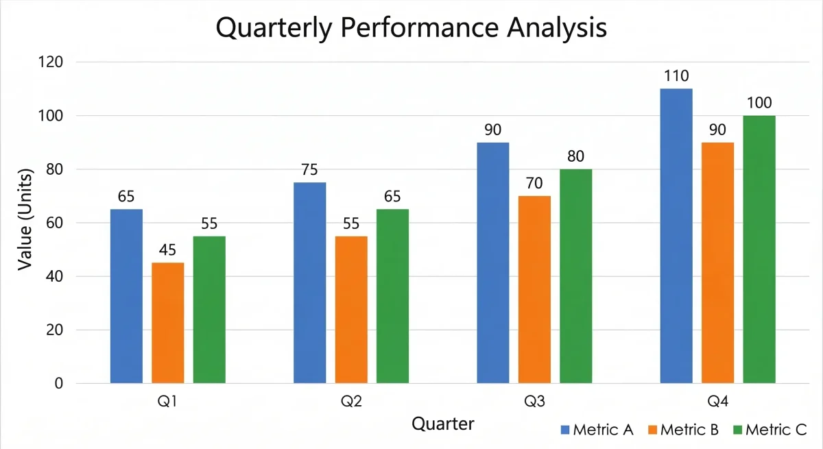
A grouped bar chart, sometimes called a clustered or multiple bar chart, places two or more bars side by side within each category, instead of just one. That lets you compare several data series against each other at the same time, category by category.
Business analysts tend to reach for this one when comparing the same metric across different groups, budget versus actual spend by department, or satisfaction scores from two different user segments. Keep it to four or five series at most. Beyond that, the clusters start to blur together and the comparison you were trying to make gets harder to see, not easier.
| Feature | Detail |
|---|---|
| Data series | Two or more |
| Best for | Side-by-side comparison of multiple series |
| Business example | Actual vs planned costs by project phase |
| Caution | Avoid more than 4 to 5 series or the chart becomes unreadable |
3. Stacked Bar Chart
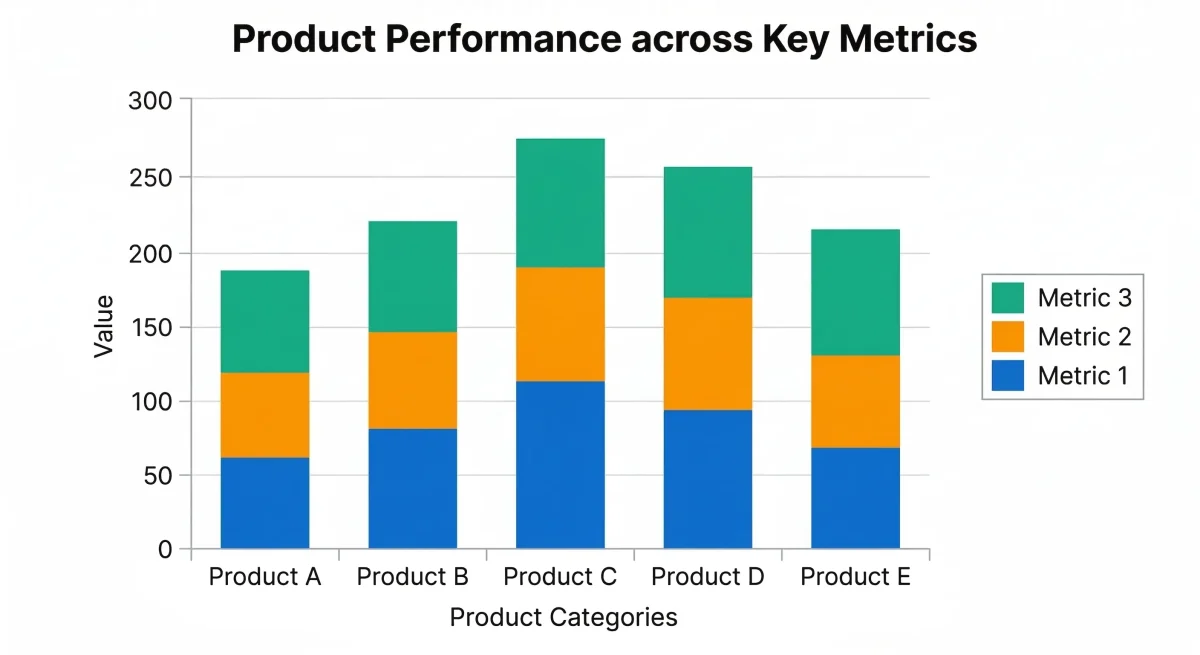
A stacked bar chart splits each bar into segments, one per sub-category, and stacks those segments on top of each other so the full bar shows the total while each slice shows its contribution. You get two stories in one bar: the whole and its parts.
This shape works well when both the total and the breakdown matter to the reader. A support team might use a stacked bar chart to show total tickets resolved per month, broken into priority levels, so leadership sees the overall trend and the mix at a glance. The one thing stacked bars are genuinely bad at is letting you compare a middle segment precisely across bars, since it doesn’t sit on a shared baseline. If that precision matters, switch to a grouped chart instead.
| Feature | Detail |
|---|---|
| Data series | Multiple (stacked into one bar) |
| Best for | Total plus component breakdown |
| Business example | Revenue by product line per quarter |
| Caution | Hard to compare middle segments across categories, use a grouped chart if precision matters |
4. 100% Stacked Bar Chart
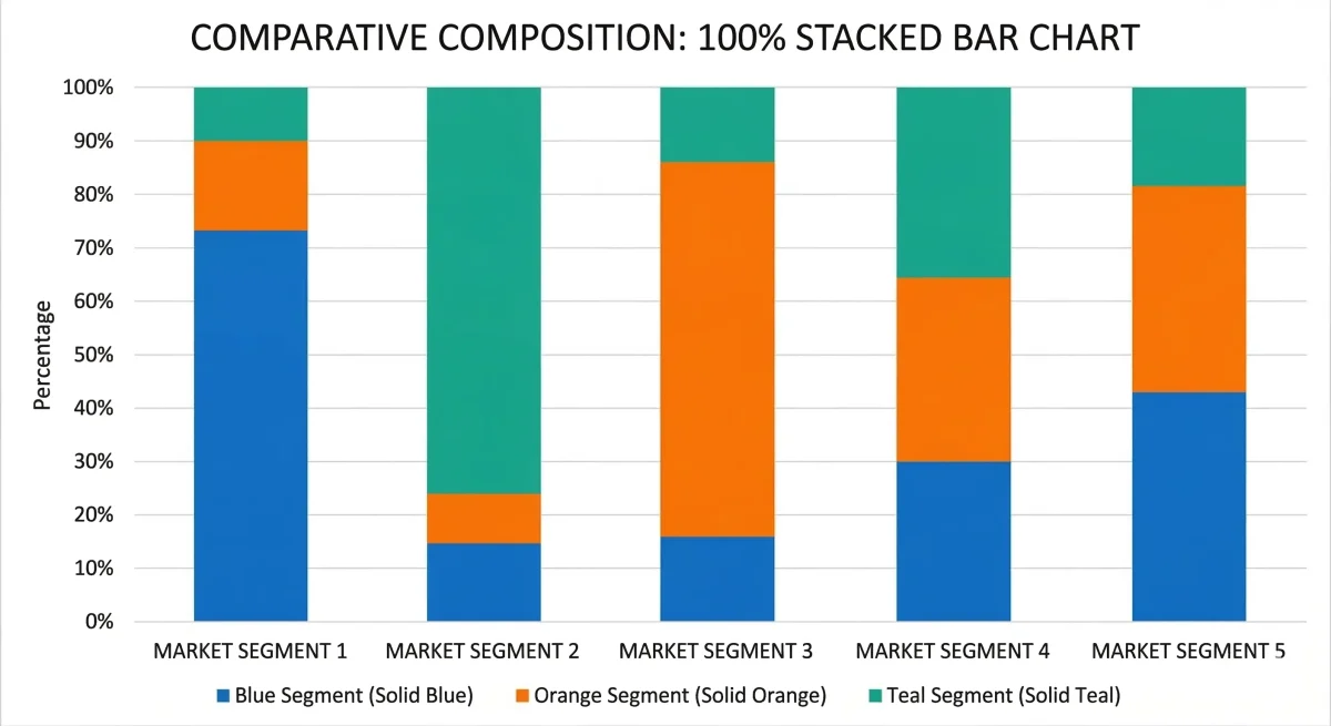
A 100% stacked bar chart, occasionally called a segmented bar chart, takes the stacked format and normalizes every bar to reach the same height, 100%. You lose the absolute totals, but you gain a clean read on relative composition, which matters most when the group totals themselves are wildly different sizes.
Say you wanted to compare the proportion of high, medium, and low severity requirements across five projects that each have a completely different total requirement count. A regular stacked chart would make that comparison messy, since taller bars would dominate visually. Normalize everything to 100%, and suddenly the proportions sit side by side on equal footing.
| Feature | Detail |
|---|---|
| Data series | Multiple (stacked, normalized to 100%) |
| Best for | Proportional or percentage comparisons |
| Business example | Proportion of requirement types (functional / non-functional / constraint) per project |
| Caution | Does not show absolute values, pair with a data table if totals also matter |
5. Horizontal Bar Chart
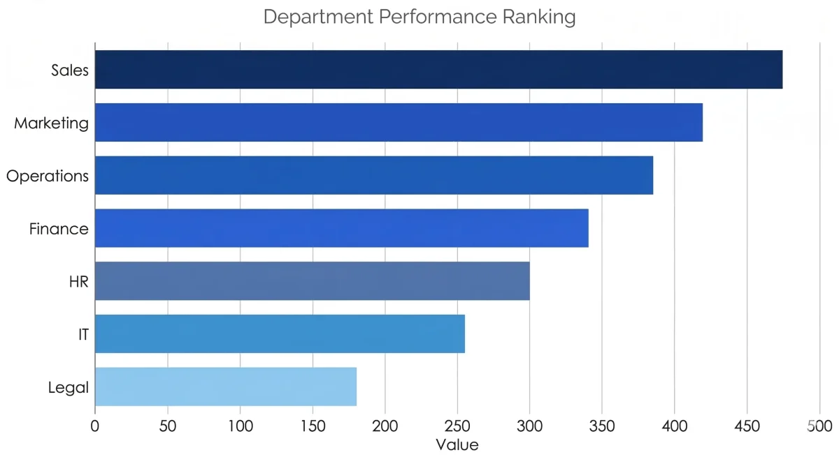
A horizontal bar chart is a standard bar chart turned 90 degrees. Categories now run down the vertical axis, values extend left to right. That single rotation solves a real, practical problem: long category names that would otherwise get squeezed, truncated, or rotated at an awkward angle on a vertical chart suddenly have room to breathe.
You’ll see horizontal bars everywhere survey results get presented, in ranking-style reports, and in project timelines built as a simplified Gantt view. Anywhere reading the category name matters more than saving vertical space, the horizontal orientation wins.
| Feature | Detail |
|---|---|
| Orientation | Bars run left to right (horizontal) |
| Best for | Long category names, many categories, ranking displays |
| Business example | Survey responses showing stakeholder priorities by name |
| Tool name (Power BI) | Clustered Bar Chart, as opposed to Clustered Column Chart for the vertical version |
6. Bar and Line Combo Chart
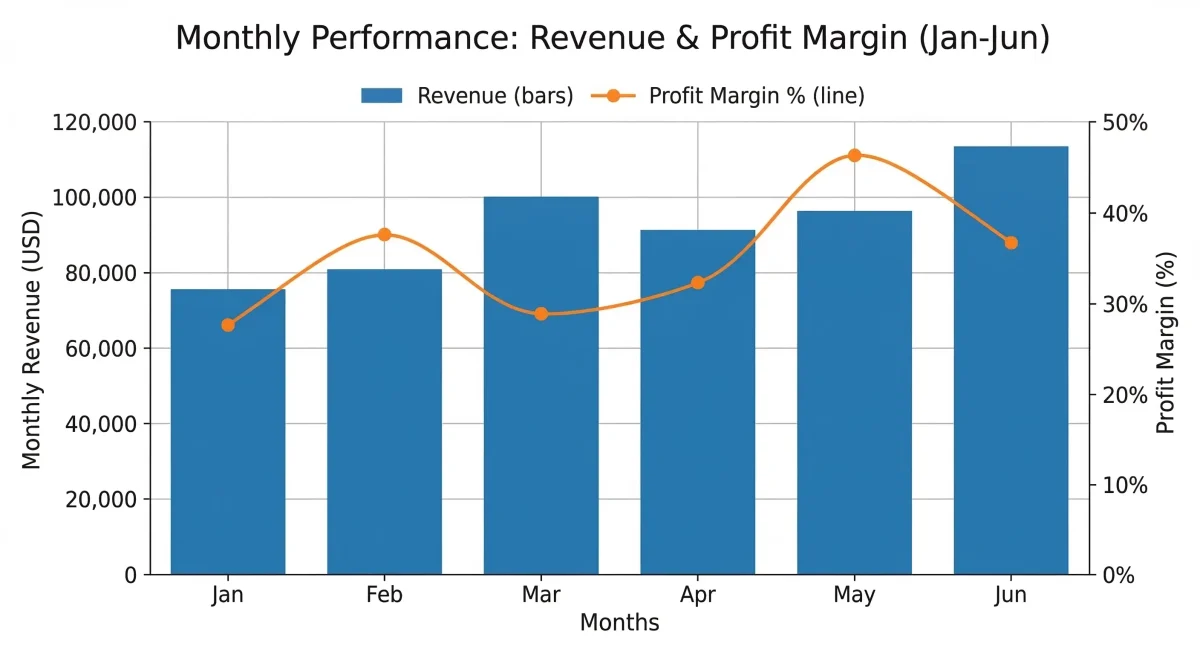
A bar and line combo chart, also known as a combination or dual-axis chart, layers a line chart directly on top of a bar chart. The two typically measure different things and sit on two separate y-axes, so you can watch two related metrics move together without building two separate charts.
The classic example in business reporting: monthly revenue plotted as bars, with a line overlay showing new customer count, two metrics, two different scales, one chart. Just be disciplined about labeling both axes clearly. A dual-axis chart with unlabeled axes is one of the easiest ways to accidentally mislead a stakeholder, even without meaning to.
| Feature | Detail |
|---|---|
| Data series | Two or more, on separate axes |
| Best for | Showing the relationship between two metrics with different units |
| Business example | Monthly costs (bar) versus profit margin percentage (line) |
| Caution | Can mislead if axes aren’t clearly labeled, always include axis labels |
Want to build these in Power BI? Our Power BI course covers every chart type in this guide, plus formatting, DAX, and dashboard design, with hands-on exercises.
Want to Create Bar Charts Like a Trained Analyst, Not Just a Curious One?
Our Power BI course at Techcanvass covers every major chart type in this guide with hands-on exercises, from basic bars to dual-axis combo charts.
Quick Comparison Table: All 6 Bar Chart Types at a Glance
| Chart Type | Also Called | Data Series | Best Used For | Axis |
|---|---|---|---|---|
| Basic Bar Chart | Simple bar chart | One | Simple comparison | Vertical |
| Grouped Bar Chart | Clustered, multiple | Two or more | Side-by-side series comparison | Vertical |
| Stacked Bar Chart | Compound bar chart | Multiple | Total + component breakdown | Vertical |
| 100% Stacked Bar | Segmented, proportional | Multiple | Proportional comparison | Vertical |
| Horizontal Bar Chart | Bar chart (in Power BI) | One or more | Long labels, ranking | Horizontal |
| Bar and Line Combo | Combination chart, dual-axis | Two+, different scales | Two metrics with different units | Vertical + line overlay |
Bar Charts in Business Analysis
Business analysts lean on bar charts constantly, whether that’s documenting requirements, presenting findings to a room of stakeholders, or building out a KPI dashboard. More often than not, a bar chart is the fastest route to a data-driven point that everyone in the room actually understands.
- Requirements tracking: the count of requirements by status, approved, in review, pending, across sprints.
- Stakeholder reporting: presenting survey results gathered from interviews or workshops.
- Gap analysis: comparing current-state metrics against future-state targets.
- Risk reporting: visualizing how often each risk category shows up across a project.
- Process metrics: tracking defect rates, cycle times, or throughput across iterations.
The BABOK Guide recognizes data modeling and visualization as a core business analysis technique. It doesn’t hand you a prescribed list of chart types, but choosing the right visualization for the dataset in front of you is exactly the kind of analytical judgment tested in the CBAP and CCBA exams.
Preparing for a BA Certification?
Techcanvass is IIBA-endorsed and offers ECBA, CCBA, and CBAP training. Visit us to see the current course schedule.
Bar Charts vs Other Chart Types
| Comparison | When to Use Bar Chart | When to Use the Other Chart |
|---|---|---|
| Bar chart vs Pie chart | Comparing values across three or more categories | Showing proportions of a whole with five or fewer categories |
| Bar chart vs Line chart | Comparing discrete categories, few time periods | Showing trends over continuous time periods |
| Bar chart vs Histogram | Categorical (nominal) data comparison | Distribution of continuous (numerical) data |
| Bar chart vs Table | A visual comparison is needed for presentations | Precise numerical values are required |
For a broader introduction to charts in Power BI, read our Power BI Introduction guide.
Frequently Asked Questions About Bar Charts
What is a bar chart in simple terms?
What are the 6 main types of bar charts?
What is the difference between a bar chart and a bar graph?
What is the difference between a bar chart and a histogram?
When should I use a stacked bar chart instead of a grouped bar chart?
What is a 100% stacked bar chart used for?
What is a horizontal bar chart best used for?
How is a bar chart used in business analysis?
Can I create bar charts in Power BI?
What is a bar chart called in statistics?
Why are bar diagrams used in statistics and data analysis?New
Related Power BI Reads
If you’re building these chart types in Power BI, here’s the rest of our Power BI series.