Master Data Storytelling: Engage Audiences with Data Insights

Why is it important to tell a story using data?
Visuals to convey key insights to business users is essential while using data analytics to drive business decisions or make changes. But just using fragmented visuals will not make an impact and show the complete picture. Data storytelling is the communication of data insights by creating an engaging dashboard and narrative using graphs and charts, bringing an emotional perspective to analytical data-driven business decision-making. It gives the audience a solid understanding of the insight and compels them to act on it. It consists of three key elements: data, a narrative that includes information that is not included but is essential to the story, and visuals. A narrative coupled with data helps explain to the audience what the data is telling. Visuals using the data provide critical insights from the data, and narratives combined with visuals engage and entertain the audience.
Business stakeholders often tend to resist changes suggested by analytical findings as they may appear risky or uncertain. In such a case, simple graphs may not persuade them to implement the change. In this scenario, compelling data storytelling can change the picture by engaging the audience and encouraging a broader and open conversation about what the data is telling. Brene Brown aptly says, “Maybe stories are just data with a soul.“
Instead of presenting the entire graph and insight in one go, adding details in sequence like an axis, followed by a data point, contrasting data points, color to show clusters, and finally changes over time will make it more powerful. Such a data story will give a dramatic effect, help the audience go through the insights step-by-step, and keep them attentive and engaged.
Data storytelling can be a turning point for the analytics success of an organization. If the analytics insights are not correctly understood and implemented, the time and efforts invested in the initiative are futile. Also, the business can miss out on growth opportunities. Thus, compelling storytelling can mean success or failure when it comes to using data for informed decision-making.
Data Storytelling is especially beneficial when the insights are counterintuitive, unpleasant, costly to implement, risky, complex, disruptive, or unexpected. Such insights may make the audience uncomfortable or defensive, and a well-crafted data story may be the most effective way of conveying and convincing audiences of such insights.
Key Steps to Consider While Framing a Data Story in Data Storytelling
Let us consider an example of a retail store that wants to group customers based on their buying propensity to develop customized marketing strategies. The analytics team identified five product categories and segregated customers into eleven segments based on these product groups. They also developed a model to classify new customers into one of the appropriate segments. Now, let us look at the steps for creating a compelling Data Storytelling approach to convey these insights to stakeholders.
1. Know Your Audience
- It is vital to make sure that the story is tailored to suit the audiences’ goals and priorities, expertise, preferences, expectations, and level of detail, keeping in mind their biases and what drives them. Even though this may seem very obvious, it is helpful to comprehensively understand the audience in the beginning itself for successful communication with data. A disconnect with the audience can spoil a good story in no time.
- It is essential to understand the storyteller’s relationship with the audience and how they will perceive the communicated information. A good trust level has higher chances of success.
- Understanding the audiences’ level of knowledge, the amount of discussion, and what is relevant to them is necessary.
- It is vital to ensure that no bias is creeping into the data story. It is best to watch out for biases that might cause the storyteller to ignore conflicting information countering their existing opinions.
- Splitting mixed audience into smaller groups will help effectively serve each group’s needs. You can split them based on the insights derived from the data, the recommended action, and the decision-makers. For example, the same story might not appeal to technical and business stakeholders.
In the above example, our audience group may consist of Senior Leadership, Product, IT, Sales, Finance, CRM Leads, and the customer service team. Through Data Storytelling, we want to communicate how the customers are classified into 11 segments and design marketing strategies. We can split the group into two: Senior Leadership, Sales, and Finance leads in one group, and Product, IT, CRM leads, and the customer service team in another.
2. Provide the Context
- The insights drawn will be convincing and grasped entirely only when backed up with the business context. This will help the audience appreciate the significance or uniqueness of the insights.
- The more invested the audience is in the business context, the more impactful the storytelling will be.
- A context will make the insight shared more actionable by empowering the audience to act.
In our example, the business context is to go one step ahead of traditional demographic segments and classify customers based on buying propensity for more effective marketing strategies and improved customer relationships. Through Data Storytelling, we can clearly communicate the value of this approach and its potential impact on the business.
3 . Choose Appropriate Visuals
- Several visuals are available, and it might not be obvious which visual to select. The clarity of what needs to be conveyed and each visual’s purpose can help choose appropriate visuals. The selected visuals should accurately and clearly, explain the insights.
- Adding context to the charts can also help better understanding.
- Draw the audiences’ attention to where you want them to focus.
- Below are some standard types of visuals:
- Text: To display simple singular metrics.
- Comparison: A bar chart can display similarities and differences for categorical data.
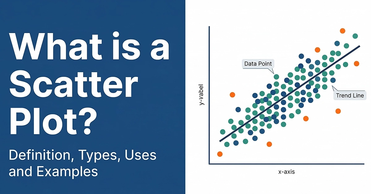
- Relationship: A scatter plot can display the relationship between variables and identify outliers and clusters.
- Trend: A line graph can show trends of continuous data over time.
- Composition: An area chart can show the relative sizes of the parts of a whole.
- Distribution: A histogram can show the frequency of distribution of values.
- Spatial: Maps can show geographic or spatial data and relationships.
- Following visual best practices while designing dashboards is essential.
- Start the axis at zero.
- Maintain the data-ink ratio.
- Avoid clutter.
- Avoid 3-D graphs.
- Leverage white space.
- Follow Gestalt principles (proximity, similarity, continuity, closure, focal point, common region, figure-ground).
- Strategic alignment and positioning.
- Consistent text formatting, symbols, use of colors and contrasts.
- Add text/annotations to add more meaning, etc.
Useful Links – Data Analytics Certification Training | Power BI Training
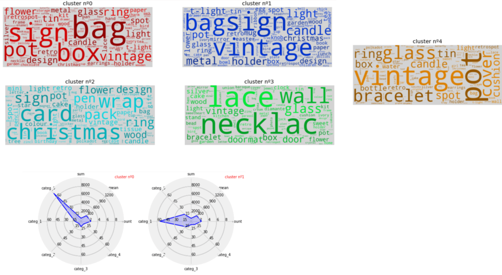
In our example, technical visualizations like silhouette charts would not help stakeholders understand the insights. Instead, through Data Storytelling, you can create a word cloud showing the different product categories and use spider or radar chart visualizations for stakeholders to differentiate each customer segment. Individual axes can contain the five product categories and attributes like the count (number of purchase visits), mean (the average price paid per order), and sum (average spend per customer). These charts will clarify to the stakeholders that each customer segment has a distinct propensity towards a product category and validate the analytical findings.
4. Focus Attention on Key Insights
- Secondary findings are also derived during data exploration and analysis many times. But, the focus during the storytelling should be on primary and key insights derived. Secondary insights supporting the context can be included in the narrative.
- Space and audience’s attention must be used wisely by getting rid of noncritical data or components.
- Data can be summarized where details are not required.
In our example, during data exploration, secondary insights such as 16.5% order cancellation and retaining high spenders with only one purchase were identified. These insights can be included in the Data Storytelling narrative instead of the main story, adding depth and context to the overall analysis.
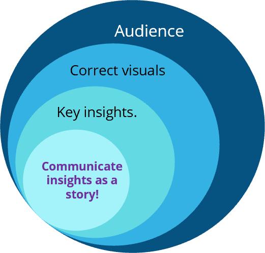
5. Communicate as a Story
- The part of data and information that should be included and excluded in the story should be decided on the context and judgement.
- Compelling visuals supported by context should be shared in a sequential narrative story format. They should begin with:
- A hook which is a notable observation acting as a turning point in the story and begins to reveal the problem or opportunity,
- An introduction to set up the context,
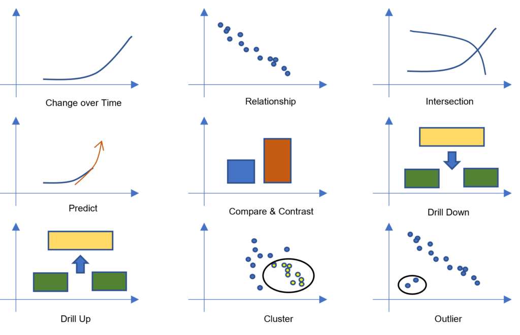
- The middle part explaining the critical data points using different story types, outlined by Ben Jones as shown below,
- And the end highlighting the call to action, lessons learned, key metrics, and other summarized vital insights.
- The specific and practical actions based on the insights should be laid out explicitly; otherwise, the story might turn into just good-to-know information.
- Also, highlighting people behind the numbers will add a more relatable human perspective to the data story.
- The key takeaways should be precise, not complex, and lengthy. They should be simple yet impactful.
In our example, to operationalize the findings of classifying new customers into one of the 11 segments, actionable insights can include steps for integrating the analytics finding with the existing CRM application.
What are the advantages of data storytelling?
- Storytelling brings out the emotional aspect and thus engages the audience.
- It is more effective in comparison to merely fact-based presentations.
- It enables the audience to focus on the key insights and takeaways with respect to the business context, leading to quicker implementation of insights.
- A compelling narrative influences and drives better decisions.
What are the limitations of data storytelling?
- Crafting a story needs special skills, is time-consuming, and requires a lot of research.
- The effectiveness of the narrative is dependent on the writer’s skills.
- Biases and self-motivated interests of the storyteller can mislead the audience.
You can find out more about using data for business analytics here.
References:
- Effective Data Storytelling by Brent Dykes
- Storytelling with Data by Cole Knaflic

Conclusion
The skill of turning raw data into captivating narratives that lead to significant findings and sound decisions is known as data storytelling. It’s not just about the numbers; it’s also about developing a human connection with your audience, arousing interest, and lighting the future course. The capacity to create an engaging data tale in an information-rich world is a superpower.
Our Data Analytics Certification Training & Power BI Training will help you get ready for success in the data analytics industry. Explore every aspect of data-driven decision-making through captivating video lectures and presentations from knowledgeable trainers. Test your knowledge on our four comprehensive practice exams and more than 500 practice questions while learning useful lessons from real-world case studies. Our creative method uses interactive flashcards, crossword puzzles, and mind maps to help you picture difficult topics and reinforce your learning. Join us to develop your abilities and become a champion in data analytics.