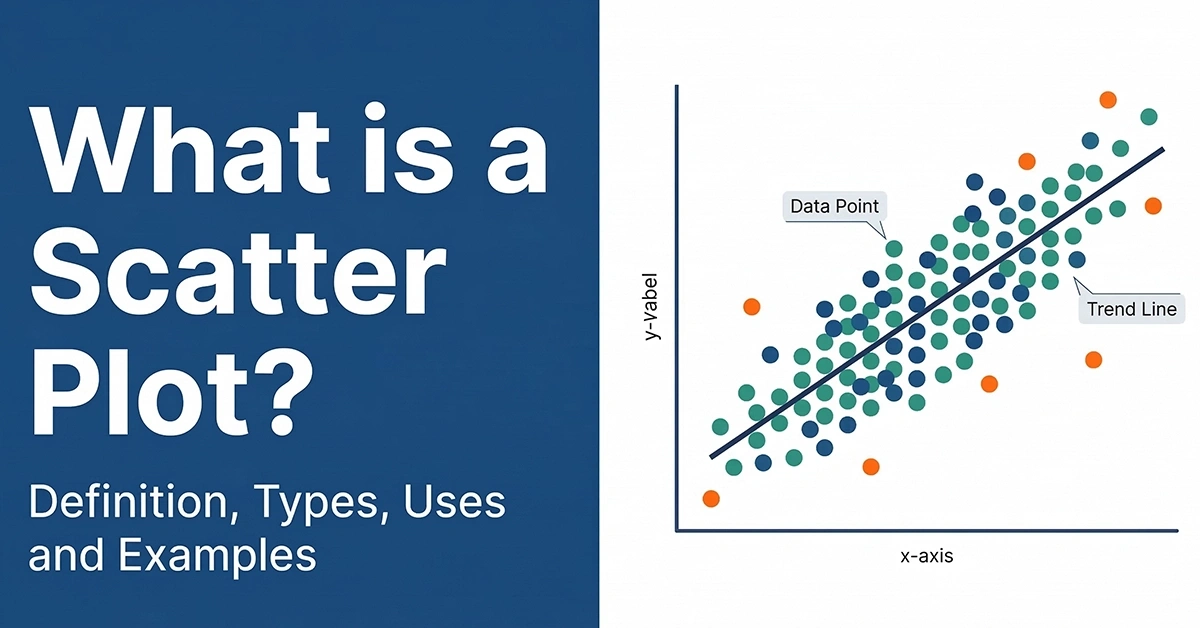
What is a Scatter Plot? Definition, Types, Uses, and Examples
| Key Facts | Details |
|---|---|
| Also called | Scatter diagram, scatterplot, scatter graph, scatter chart |
| Axes | X-axis (horizontal) = independent variable | Y-axis (vertical) = dependent variable |
| Each data point represents | One paired observation from your dataset |
| Main uses | Identify correlation, spot outliers, visualise trends, test hypotheses |
| Types of correlation shown | Strong/weak positive, strong/weak negative, no correlation, non-linear |
| Common tools | Tableau, Power BI, Excel, Python (matplotlib/seaborn), R |
| Relevant for | Data Analysts, Business Analysts, Statisticians, Researchers |
In This Article
What is a Scatter Plot?
A scatter plot is a chart that shows the relationship between two numerical variables by placing data points on a two-dimensional grid. The horizontal axis (x-axis) represents one variable and the vertical axis (y-axis) represents the other. Every dot on the chart is one data observation, plotted at the coordinates that match its two values.
The key purpose of a scatter plot is not to show the exact values — it is to show the pattern. When the dots form a clear upward or downward slope, that tells you the two variables are correlated. When the dots are randomly scattered with no shape, it tells you the two variables have no meaningful relationship.
Scatter plots are one of the most commonly used charts in data analysis, business intelligence, and research. They are especially useful for identifying outliers, spotting clusters of related observations, and testing whether a trend line (line of best fit) can be drawn through the data to make predictions.
For Business Analysts and Data Analysts, scatter plots are a core visualisation skill — used in everything from customer behaviour analysis to quality control, market research, and financial modelling.
To build practical skills in data visualisation including scatter plots, explore our Power BI training, or see our IIBA-CBDA training programme for a comprehensive curriculum.
Scatter Plot Definition and Key Components
Formal Definition
A scatter plot is a statistical chart that uses Cartesian coordinates to display values for two variables from a dataset. Each observation in the dataset is represented as a single point, positioned according to the values of the two variables on the respective axes.
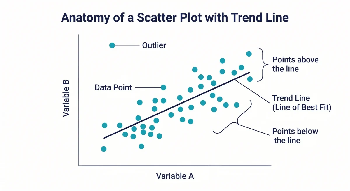
Key Components of a Scatter Plot
X-axis (horizontal axis): Represents the independent variable — the one that is presumed to cause or influence the other. In a study of study hours vs exam scores, study hours would go on the x-axis.
Y-axis (vertical axis): Represents the dependent variable — the one that is expected to change in response to the independent variable. Exam scores would go on the y-axis in the example above.
Data points (dots): Each dot represents one paired observation. If you have 50 students in your dataset, there will be 50 dots on the scatter plot.
Trend line (line of best fit): An optional straight or curved line drawn through the data points to show the overall direction of the relationship. See the trend line section below for full detail.
Axes labels and title: Good scatter plots always include descriptive labels on both axes and a title that identifies the variables being compared.
Types of Scatter Plots — Correlation Types
The pattern formed by the data points in a scatter plot tells you what type of relationship exists between the two variables. There are five main types:
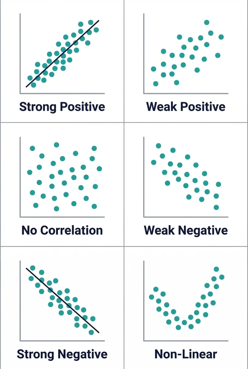
1. Strong Positive Correlation
The data points form a tight cluster that rises from bottom-left to top-right. As one variable increases, the other increases proportionally. Example: hours of exercise per week and resting heart rate improvement. The points are closely packed around an imaginary upward-sloping line.
2. Weak Positive Correlation
The data points show a general upward trend from left to right but are spread out loosely. There is still a positive relationship, but the pattern is less predictable. Example: advertising spend and sales — the relationship exists but other factors introduce variability.
3. No Correlation
The data points are randomly scattered with no discernible pattern — neither upward nor downward. This tells you the two variables have no meaningful linear relationship. Example: shoe size and exam scores.
4. Weak Negative Correlation
The data points show a general downward trend from left to right but are spread out loosely. As one variable increases, the other tends to decrease, but inconsistently. Example: hours of television watched and academic performance in a loosely structured study.
5. Strong Negative Correlation
The data points form a tight cluster that falls steeply from top-left to bottom-right. As one variable increases, the other decreases in a clear, consistent pattern. Example: price increases and demand reduction in a price-sensitive market.
Trend Lines in Scatter Plots
What is a Trend Line on a Scatter Plot?
A trend line (also called a line of best fit or regression line) is a straight line drawn through a scatter plot to show the general direction of the data. It does not pass through all points — instead, it is positioned so that roughly equal numbers of points fall above and below the line. The trend line makes it easier to see the overall pattern and to make predictions.
What Does a Trend Line Tell You?
A trend line communicates four things: the direction of the relationship (positive slope = both variables increase together; negative slope = one increases as the other decreases), the strength of the relationship (points tightly clustered around the line = strong relationship; points spread out = weak relationship), the ability to predict (a reliable trend line can be used to estimate the y-value for a given x-value), and the presence of outliers (points far from the trend line stand out clearly).
Positive vs Negative Trend Line
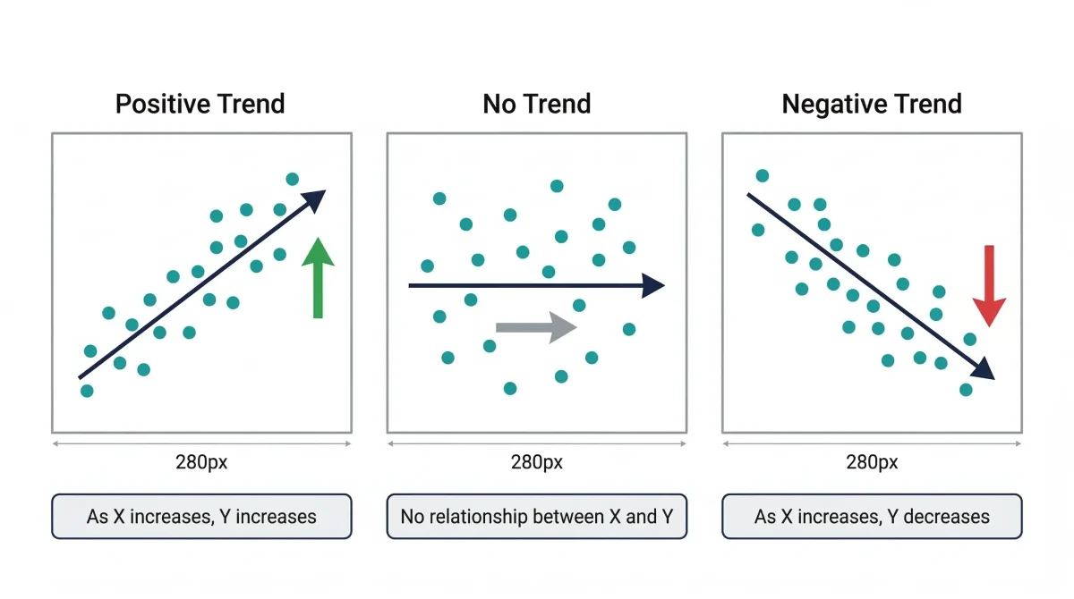
A positive trend line slopes upward from left to right. It indicates a positive correlation between the two variables. A negative trend line slopes downward from left to right. It indicates a negative correlation — as one variable increases, the other decreases. A horizontal trend line indicates no relationship between the variables.
R-Squared Value
The R-squared value (also written R2) measures how well the trend line fits the data. An R-squared of 1.0 means all data points fall perfectly on the line — a perfect fit. An R-squared of 0 means the trend line explains none of the variation in the data. In practice, R-squared above 0.7 is considered a strong fit for most business analysis purposes.
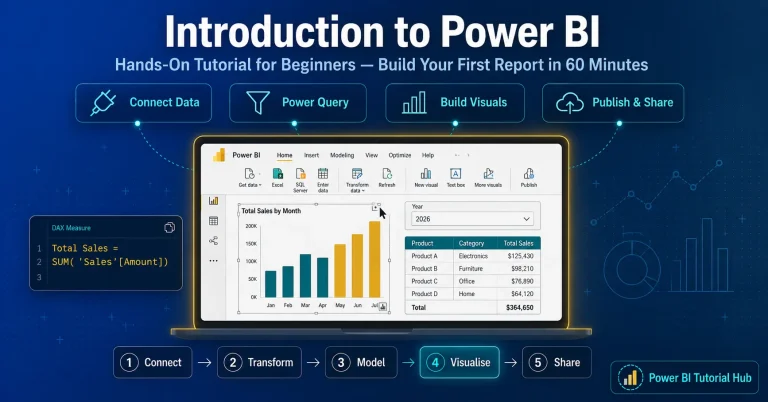
How to Add a Trend Line in Tableau and Power BI
In Tableau: drag two measures to the scatter plot view, then go to Analytics pane and drag ‘Trend Line’ onto the chart. Select Linear, Logarithmic, or Polynomial depending on your data pattern.
In Power BI: create a scatter chart, click on the chart, go to the Analytics pane in the Visualizations panel, and toggle on ‘Trend line’. You can customise colour, transparency, and whether to show the forecast.
Linear vs Non-Linear Associations in Scatter Plots
What is a Linear Association?
A linear association in a scatter plot means the relationship between the two variables can be approximated by a straight line. The data points follow a roughly straight path — either upward or downward. Linear associations can be strong (points close to the line) or weak (points spread out from the line).
What is a Non-Linear Association?
A non-linear association means the relationship between the variables follows a curve rather than a straight line. Examples include exponential growth patterns, U-shaped relationships (where a variable has an optimal value), and cyclical patterns. When a scatter plot shows a non-linear pattern, a curved trend line (logarithmic, polynomial, or exponential) is more appropriate than a straight line of best fit.
How to Tell if a Scatter Plot is Linear
Three visual checks: First, can you draw a single straight line that roughly follows the path of the data points? If yes, the association is approximately linear. Second, are the residuals (distances between each point and the trend line) random, or do they form a curved pattern? A curved pattern of residuals suggests non-linearity. Third, does the R-squared value change significantly when you switch from a linear to a curved trend line? A large improvement indicates the relationship is non-linear.
| Association Type | Visual Pattern | Trend Line Type | Example |
|---|---|---|---|
| Strong positive linear | Tight upward cluster | Straight line, positive slope | Study hours vs exam score |
| Weak positive linear | Loose upward scatter | Straight line, gentle positive slope | Advertising spend vs sales |
| Strong negative linear | Tight downward cluster | Straight line, negative slope | Price increase vs quantity demanded |
| Non-linear (exponential) | Steep curve upward | Exponential curve | Bacterial growth over time |
| No association | Random scatter | No meaningful trend line | Shoe size vs intelligence score |
How to Read and Interpret a Scatter Plot
Reading a scatter plot is a four-step process. Work through these steps in order:
- Step 1 — Identify the direction. Do the points trend upward from left to right (positive), downward (negative), or show no pattern (no correlation)?
- Step 2 — Assess the strength. Are the points tightly clustered around the trend line (strong relationship) or spread out loosely (weak relationship)?
- Step 3 — Check the form. Does the pattern look like it could be described by a straight line (linear) or does it curve (non-linear)?
- Step 4 — Look for outliers. Are there any points that sit far from the main cluster or trend line? These outliers may represent data entry errors, exceptional cases, or genuinely interesting anomalies worth investigating.
Worked Example: Scatter Plot Interpretation
Suppose you have a scatter plot of monthly advertising spend (x-axis) against monthly sales revenue (y-axis) for a company over 24 months. You observe:
- The points generally rise from left to right — positive direction.
- The points are loosely scattered, not tightly packed — weak to moderate strength.
- The pattern looks approximately linear.
- Two points in the top-left corner (high sales, low spend in two months) appear to be outliers — possibly months with external sales drivers such as seasonal demand or a viral social media post.
Interpretation: There is a positive but moderate relationship between advertising spend and sales. Increasing spend tends to increase sales, but other factors also play a significant role. The two outlier months warrant further investigation to understand what drove sales without corresponding ad spend.
Scatter Plots with Reference Lines and Clusters
Reference Lines
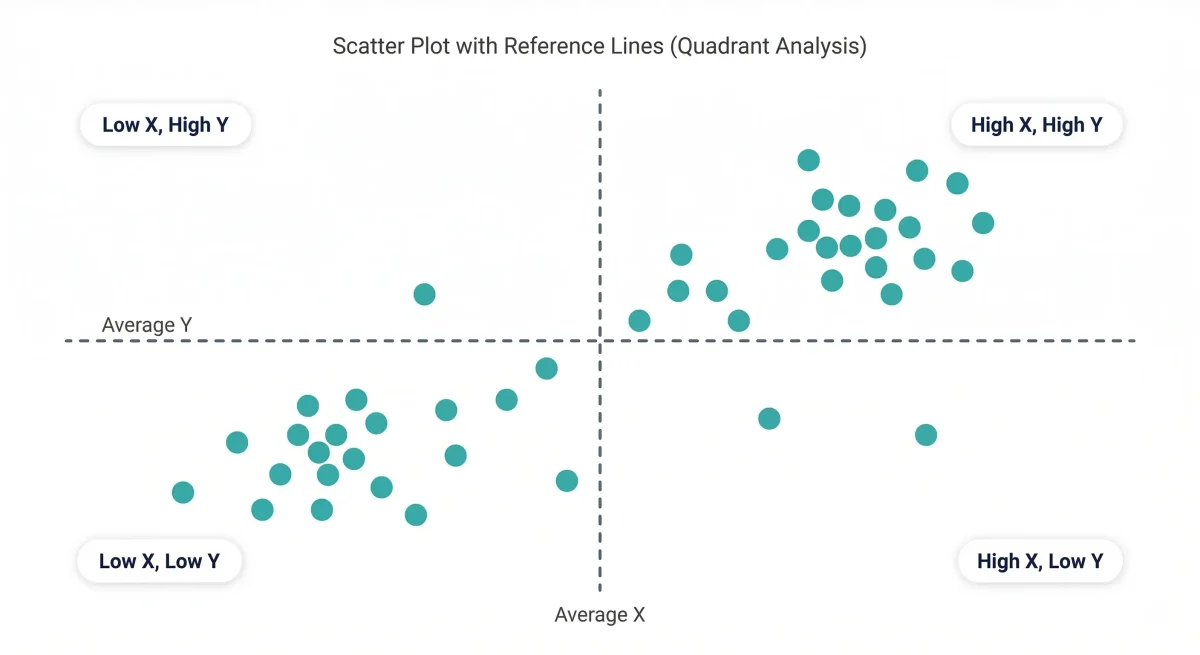
Reference lines are horizontal or vertical lines added to a scatter plot to mark a specific threshold, average, or target value. When you add both a horizontal and vertical reference line (for example, at the mean of each variable), you divide the scatter plot into four quadrants. Each quadrant tells a different story: top-right = above average on both variables; bottom-left = below average on both; top-left = high on y but low on x; bottom-right = high on x but low on y.
This quadrant analysis is used in business for customer segmentation (high value vs low engagement), product portfolio analysis (high market share vs high growth), and performance management (above target on one metric vs another).
Clusters
A cluster in a scatter plot is a group of data points that are tightly concentrated in one area of the chart, separated from other groups. Clusters suggest that subgroups exist within your data that behave differently from each other. For example, a scatter plot of customer spending vs age might show two distinct clusters — one for young occasional buyers and one for older high-frequency buyers — suggesting two distinct customer segments with different behaviour patterns.
Uses and When to Use a Scatter Plot
Scatter plots are the right chart to use when you want to explore the relationship between two numerical variables. They are not suitable for categorical data or for showing trends over time (use a line chart for that). Here are the six most common use cases:
- Correlation analysis: Testing whether two variables move together — for example, whether customer satisfaction scores correlate with repeat purchase rates.
- Trend identification: Spotting whether a relationship exists before applying regression analysis or more complex modelling.
- Outlier detection: Identifying data points that sit far outside the expected pattern, which may indicate data errors or exceptional cases worth investigating.
- Cluster identification: Discovering natural groupings in data — for example, customer segments or product performance tiers.
- Hypothesis testing: Visually testing whether a proposed relationship between two variables appears to exist in the data before building a statistical model.
- Business intelligence reporting: In Tableau and Power BI, scatter plots with reference line quadrants are commonly used in executive dashboards for portfolio analysis and performance comparison.
When NOT to Use a Scatter Plot
Do not use a scatter plot when: you have categorical (non-numerical) data on either axis, you want to show a single variable’s distribution over time (use a line chart), you have too many data points and the chart becomes unreadably crowded (use a density plot or hexbin chart instead), or when you want to show parts of a whole (use a pie or bar chart).
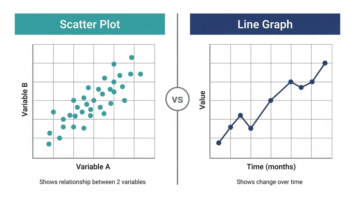
Scatter Plot vs Line Graph — Key Differences
| Dimension | Scatter Plot | Line Graph |
|---|---|---|
| Purpose | Show relationship between two variables | Show change in one variable over time |
| X-axis | A numerical variable (not time) | Usually time (date, month, year) |
| Data points | Dots placed freely based on two values | Dots connected by lines in sequence |
| Connection of points | Points are NOT connected | Points ARE connected in order |
| Best for | Correlation, outliers, clusters | Trends over time, growth, decline |
| Number of variables | Always two numerical variables | One variable against time |
| Can show prediction | Yes — via trend line extrapolation | Yes — via forecast extension |
| Common use | Customer analysis, quality control | Sales trends, stock prices, temperature changes |
Scatter Plots in Tableau and Power BI
Both Tableau and Power BI offer built-in scatter chart functionality with trend lines, reference lines, clustering, and parameter controls.
Creating a Scatter Plot in Tableau
In Tableau Desktop, drag one measure to the Columns shelf and another to the Rows shelf. Tableau automatically creates a scatter plot. To add a trend line, open the Analytics pane and drag ‘Trend Line’ onto the chart. Tableau supports linear, logarithmic, exponential, power, and polynomial trend lines. The R-squared and p-value are displayed automatically when you hover over the trend line.
Creating a Scatter Plot in Power BI
In Power BI Desktop, select the Scatter chart visual from the Visualizations pane. Place your numerical variables in the X-axis and Y-axis fields. To add a trend line, click on the chart, go to the Analytics pane, and toggle ‘Trend Line’ on. Power BI also supports a ‘Play Axis’ that animates the scatter plot across time periods — a powerful feature for presenting trends to stakeholders.
To learn scatter charts, dashboards, and full Power BI analytics in a structured programme, see our Power BI course.
Frequently Asked Questions: Scatter Plots
The main purpose of a scatter plot is to show the relationship between two numerical variables and to reveal whether a correlation exists between them. By plotting each data point at the coordinates that match its two values, a scatter plot makes visible patterns that would be invisible in a table of numbers.
Beyond identifying correlation, scatter plots are also used to detect outliers, find clusters within a dataset, and visually test hypotheses. In business, they are valuable for customer segmentation and quality control analysis.
A scatter plot places individual dots based on the values of two variables without connecting them, focusing on correlation. A line graph typically shows how one variable changes over time, with the x-axis representing a time period and dots connected in sequence by a line.
Key rule: use a line graph if one of your variables is time; use a scatter plot if both are numerical measurements and you want to explore their relationship.
A trend line (or line of best fit) shows the overall direction and strength of the relationship. The slope tells you the direction (positive, negative, or no relationship), while the tightness of data points around the line indicates the strength of that relationship.
A linear association means the relationship between variables can be described by a straight line. The strength is determined by how closely points cluster around that straight path. It’s important to check if a pattern is truly linear before applying linear regression models.
A cluster is a group of data points concentrated in one area with gaps separating them from other groups. Clusters indicate that your data contains subgroups (like distinct customer segments) that behave differently from each other.
A scatter plot reveals five types of correlation: strong positive, weak positive, no correlation, weak negative, and strong negative. However, remember that correlation does not imply causation — a pattern doesn’t prove one variable causes the other.
Use a scatter plot for two numerical variables to check if they move together. Use a bar chart to compare quantities across distinct categories. Example: use a scatter plot for ‘Ad spend vs Sales’ but a bar chart for ‘Sales by Region’.
They are exactly the same. ‘Scatter diagram’ is more common in quality management and PMP contexts, while ‘scatter plot’ is standard in data science and business intelligence. Tools like Tableau and Power BI often call them ‘scatter charts’.
A negative trend moves from top-left to bottom-right, meaning as one variable increases, the other decreases. Example: a scatter plot of ‘Price vs Demand’ typically shows a negative trend because higher prices lead to lower demand.
Yes. A third or fourth variable can be added through the size of the dots (bubble chart), color coding, or dot shapes. Tools like Power BI and Tableau allow you to add these extra dimensions to a standard scatter plot easily.