What is histogram? Why is it used?

Definition
A histogram is a type of bar graph that is used to show the frequency of data within equal intervals [bins] some value. In the chart, each bar is representative of a specified interval with the same shown on x-axis and count of datapoints in that range plotted against y-axis. These are excellent for quickly understanding the distribution and patterns of shapes across your dataset in an easy-to-interpret manner.
Components of histogram
- Title: Describes the context on what is the chart about.
- X-axis: Represents the groups in fixed intervals called bins.
Bin Width: Defines the span of each bin. The range is the values between the lower limit (lowest value in that bin) and the upper limit, where this interval includes equal to and greater than at one side of it, and less than on another side. Note: The highest limit value is always left out of the range.
No of bins: – The no of distinct groups across which frequency needs to be analysed.
- Y-axis: This displays the frequency. The frequency, displayed on the y-axis, refers to the number of observations found in each bin.”
Useful Links – Introduction to Power BI | Power BI Certification Training
Reading a histogram
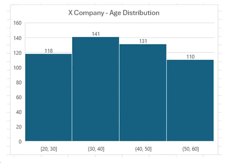
- Title: Explains that the chart represents the age distribution of employees in Company X.
- X-axis: Age Category with Bins such as [20–30][30–40][40–50][50–60]
Bin Width: Tells gap to use the range each bin takes care of (ten years in this example case). So an employee with age 30 falls into the bin [30-40] instead of [20-30] because is the upper boundary which is not included in previous bin.
No of Bins: The data are categorized into four groups of age.
- Y-axis: Showing the number of employees in each bin, or essentially count/frequency
In the 2nd bin ([20–30]) we have 118 employees and in the fourth bin ([30–40]), there are 141 employees.
The histogram above depicts that the age bracket 30–40 has the highest number of employees which is 141 and for group 40–50 it is on second position with an employee count of 131.
Requirements for creating a histogram
- Numerical Data: Make sure your data is either continuous or discrete (e.g., scores, heights, ages).
- Data Range: Identify the minimum and maximum values in your dataset to establish the span for the bins.
- Decide Bin Intervals: Select the number of bins and their widths based on the characteristics of your data and the analysis objectives.
- Frequency Count: Compute the frequency, or count of data points, for each bin interval
Useful Links – Introduction to Power BI | Power BI Certification Training
Applications of Histograms
- Understanding Data Distribution: It shows the general shape and spread of the data if it is normal or skewed.
- Pattern Finder: Identifies trends by noting significant peaks gaps or clusters in the data
- Anomalies detection: Helps to easily identify anomalies or outliers. the ones that are far off from the central trend.
- Checking for Symmetry: It checks if the data is symmetrical or skewed and has multiple peaks.
- Variability Measures: It compares how wide the spread values are, and dispersion is in different datasets.
Types of Histograms
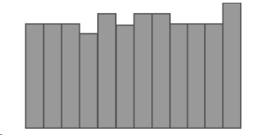
- Uniform Histogram: This kind of histogram presents bars with about the same height, which means that all data values are distributed uniformly across the whole range.
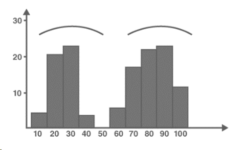
- Bimodal Histogram: A histogram that has two peaks, indicating the existence of two populations or clusters within the dataset.
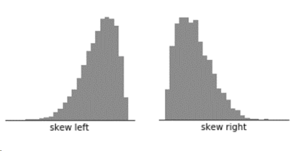
- Skewed Histograms:
- Positively Skewed Histogram (Skew Right): Most data are grouped to the left side with a long tail reaching towards right.
- Negatively Skewed (Skew Left): The majority of data points are on the right and the tail is stretched to the left.
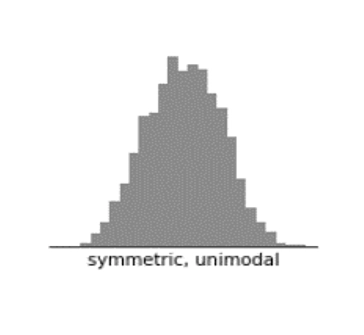
- Normal Distribution Histogram: This type is marked by a bell-shape curve and has a single peak at the center, showing its standard normal distribution pattern.
Useful Links – Introduction to Power BI | Power BI Certification Training
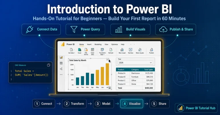
Steps to create a histogram chart visual in Power BI
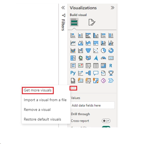
- Open PBI Desktop, navigate to the visualization section in the right side. By default, there is no inbuilt visual for histogram, so we will import a custom visual. Click on the three ellipses, and click on “Get more visuals”
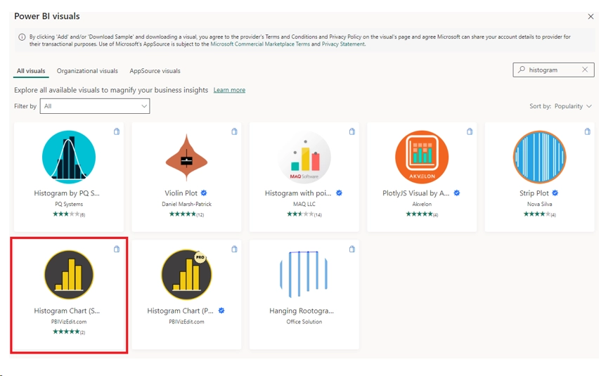
2. Search for Histogram and select the “Histogram Chart” as shown below.
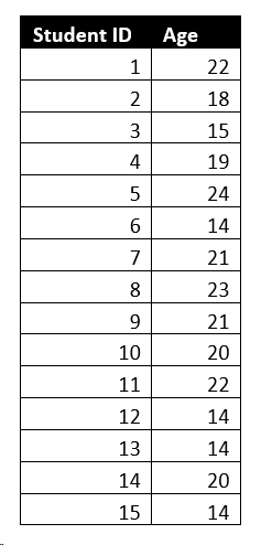
3. Click on Enter data in the Ribbon and paste the below data. Name the table as “Student Age”
4. Once you enter data, select the histogram visual. Drag the “Age” column from the data tab into Value 1 field. Right click on that field and ensure that “Don’t summarize” is selected.
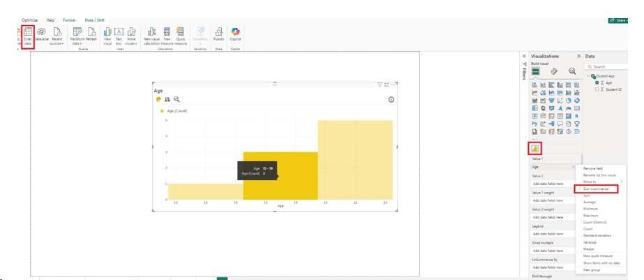
5. Power BI will automatically create the bins, and the range based on the data and provide the above output.
Useful Links – Introduction to Power BI | Power BI Certification Training
Points to remember
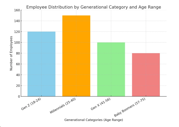
- Always choose no of bins and range based on domain understanding – In the above example of analysing age in the company, we can group the age buckets as below
- Gen Z (Youth Generation): Ages: 18 – 24
- Millennials (Gen Y): Ages: 25 – 40
- Gen X: Ages: 41 – 56
- Baby Boomers: Ages: 57 – 75
Note that the bin sizes are inconsistent and now the data is turned into categories so the representation will have gaps and not be continuous and the output will not be a histogram but a bar chart.
Conclusion
Histograms are an effective method for displaying the distribution of numerical data. They enable quick detection of patterns like central tendency, spread, and outliers. By organizing data into bins, histograms illustrate the distribution’s shape—whether it’s normal, skewed, uniform, or has multiple peaks. This visualization aids in comprehending the overall structure of the dataset, making it easier to derive insights for informed decision-making in areas like quality management, finance, and research.
Useful Links – Introduction to Power BI | Power BI Certification Training