Introduction to Power BI: A Hands-On Tutorial for Beginners
This introduction to Power BI is a hands-on, step-by-step tutorial. Instead of reading about features, you will install the tool, connect to data, build your first interactive report, write your first DAX measure, and publish a dashboard you can share.
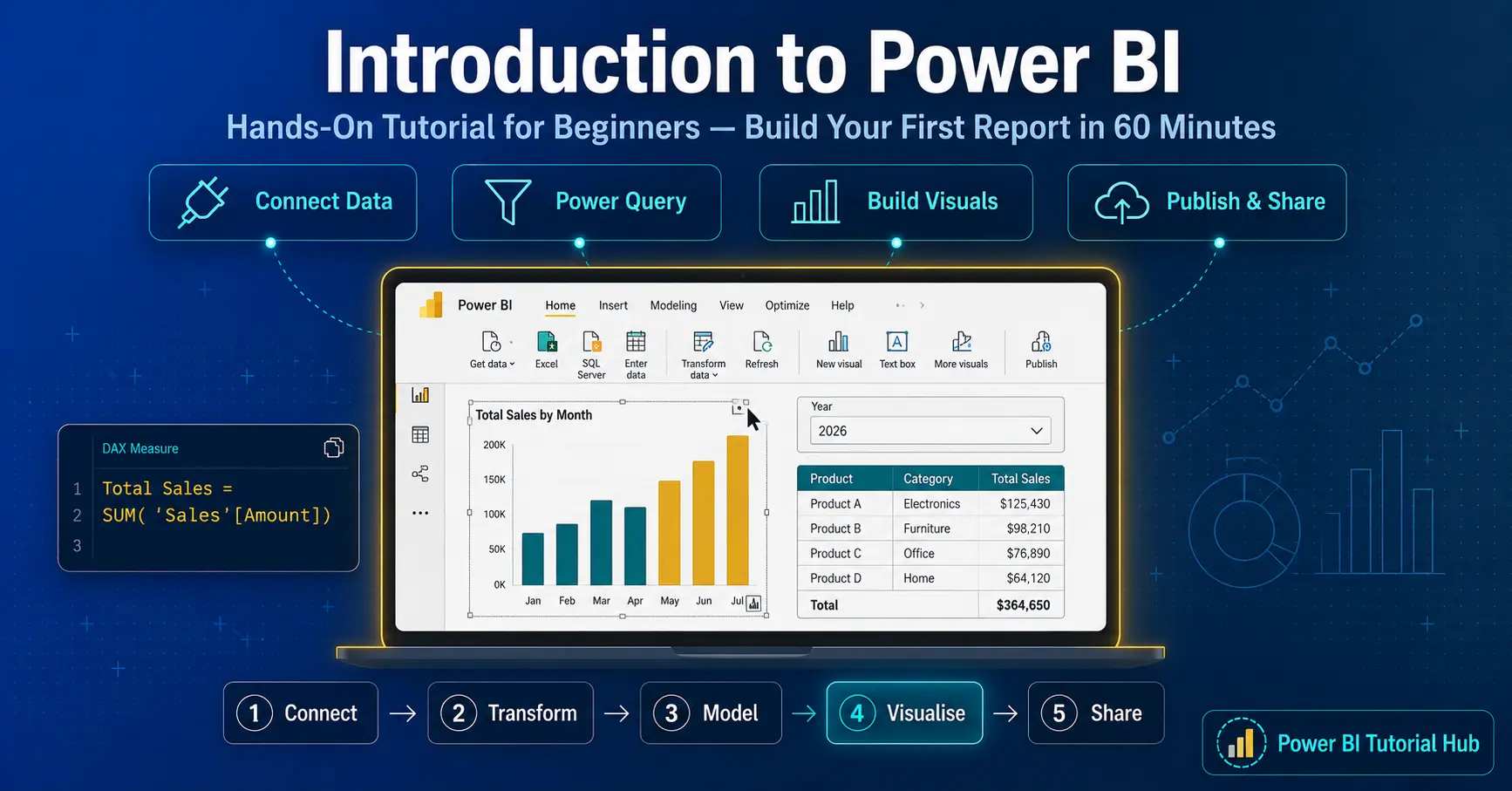
How to use this tutorial
If you have wanted to learn Power BI but did not know where to start, this is your starting point. Rather than explaining theory, this guide walks you through building something real, one step at a time. Open Power BI Desktop on a second screen and follow along.
By the end you will have a working report, a basic data model, your first DAX measure, and a published dashboard. That is the fastest way to actually learn the tool: build first, refine later.
What you will build in this tutorial
This is a practical introduction. Every section produces something you can see on your screen. Here is what you will have created by the time you finish.
A live data connection
Connect Power BI to an Excel or CSV file and load it, ready to shape and visualise.
A cleaned dataset
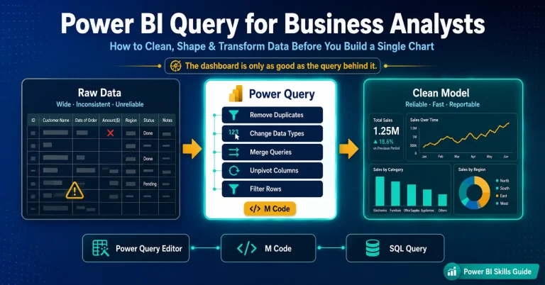
Use Power Query to remove bad rows, fix data types, and shape your data before building.
An interactive report
Build a bar chart and a table, then add a slicer so the report filters as you click.
Your first DAX measure
Write a simple measure with SUM and CALCULATE to create a custom calculation.
A published dashboard
Publish your report to the Power BI Service and share it from the cloud.
A repeatable workflow
Learn the five-stage process so you can build any future report on your own.
Before you begin
You only need two things to follow this tutorial, and both are free. There is no coding required to get started, and you can complete every step on a standard Windows laptop.
1. Install Power BI Desktop. It is free from the Microsoft Store (search “Power BI Desktop”) or the Microsoft Power BI website. It runs on Windows only. On a Mac, use the web-based Power BI Service or run Windows in a virtual machine.
2. Grab a sample dataset. Any Excel or CSV file with a few columns of real data works. A simple sales file with date, region, product, and amount columns is perfect for practice.
The five-stage workflow you will follow
Every report you ever build in Power BI follows the same five stages. Learn this flow once and you can repeat it for any dataset. In this tutorial you will perform each stage yourself.
Connect
Link to your data source
Transform
Clean and shape data
Model
Relationships and DAX
Visualise
Build charts and slicers
Share
Publish to the cloud
Connect pulls raw data in from Excel, a CSV, SQL Server, or one of hundreds of other sources. Transform uses Power Query to clean that data: remove duplicates, fix column types, and filter rows. Model defines relationships between tables and adds calculations with DAX. Visualise is where you drag fields onto the canvas to create charts, tables, and slicers. Share publishes the finished report to the Power BI Service so others can use it.
Ready to build one yourself?
Follow the full step-by-step dashboard guide further down this page.
DAX basics: your first four functions
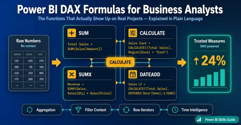
DAX (Data Analysis Expressions) is the formula language for custom calculations. You do not need to master all of it. These four functions cover most of what a beginner needs, and the most important concept to understand is filter context, which CALCULATE controls.
SUM
Adds up a numeric column. The simplest place to start for totals like revenue or quantity.
CALCULATE
Changes the filter context of a calculation. The single most important DAX function to understand.
CALCULATE([Total Sales],
‘Sales'[Region]=”India”)
DIVIDE
Divides safely and returns a blank instead of an error when the denominator is zero.
DIVIDE([Profit],[Total Sales])
DATEADD
Shifts dates for time comparisons, such as comparing this period to the same period last year.
CALCULATE([Total Sales],
DATEADD(‘Date'[Date],-1,YEAR))
Ready to make your reports faster and cleaner?
Once you are comfortable building, learn how to optimise Power BI reports for speed.
How to Build a Power BI Dashboard: Step by Step Guide
Microsoft Power BI is more than just charts — it’s about telling a story with your data. It allows users to convert their raw data into interactive charts, visuals and analyse data to get meaningful insights.
In this guided article, we’ll walk through creating a Poer BI Report using desktop application. By the end, you will learn how to build your own professional-looking report.
Importing the Dataset
Start by bringing your data into Power BI:
- Open Power BI Desktop and choose blank report.
- Go to Home → Get Data → Excel.
In this article, we will use excel file naming “Sample Dataset.xlsx”.
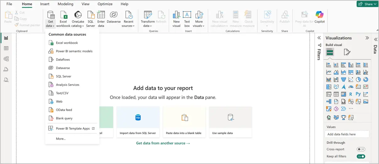
Select “Sample Dataset.xlsx” by browsing the file from the location it is placed in the local drive.
Once file is selected, a Navigator window will get open (refer below screenshot). Load the Orders worksheet by checking the box in front.
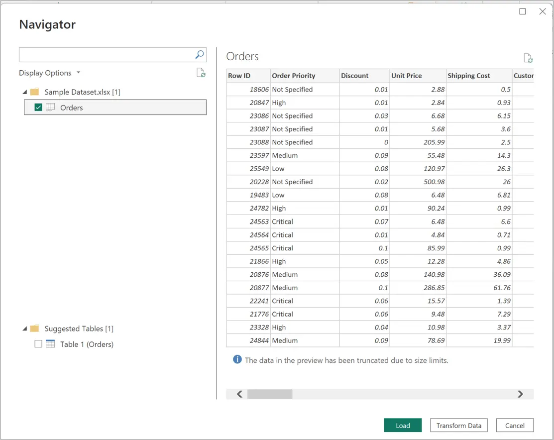
- Click Load, to simply load the data into Power BI if the data is clean. It takes few seconds to process and load the data into the Power BI file.
- Choose Transform Data to perform data cleaning operations, if your data has anomalies.
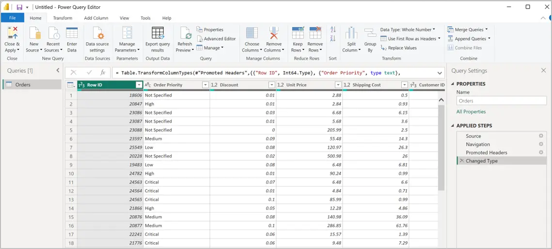
- Clicking “Transform Data” will open a new window called “Power Query Editor” window.
- Here, you can perform basic-to-complex transformation like:
- Replace missing values
- Split columns using delimiter
- Shuffle the columns
- Check/Uncheck the columns you want to load
- Add custom columns etc.
- Once transformation is complete, choose “Close & Apply” option under “Close & Apply” under Home menu.
- This step will process and load the data in Power BI file.
Exploring the Data
Before building visuals, understand your data on which you are working with:
- Customer details: Name, Segment, Region, State, City
- Order details: Order ID, Order Date, Ship Date, Priority, Ship Mode
- Product info: Category, Sub-Category, Container, Product Name
- Financials: Sales, Profit, Discount, Quantity, Shipping Cost
For example: “Bonnie Potter ordered Xerox Paper in Washington with a 3% discount, resulting in a loss of -47.64 profit.”
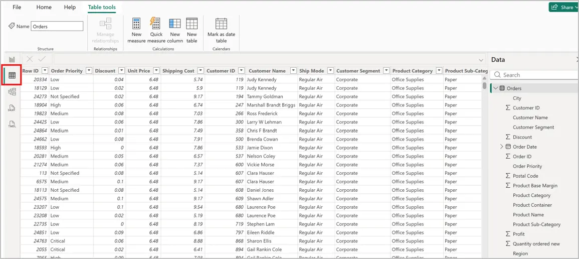
- From the Data tab on the left pane, you can view the tabular data we just loaded.
- On the right-side pane, you will find the list of fields available in the table.
Modelling the Data
Data modelling ensures your calculations are accurate:
- Check data types: Dates should be Date; numbers should be Whole number or Decimal.
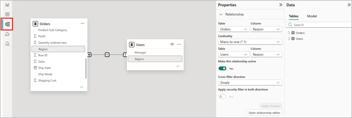
- While loading multiple worksheets or excel files, the tables can join together with a common field.
- Power BI auto-detect common field and generate relation between two tables. There is still provision to modify the relation later.
- You can check the relations between the tables from the Model tab on the left side.
Create DAX measures for reusable calculations:
Building Visuals
Now the fun part — turning data into visuals. For this, choosing right visual to depict the information is very important.
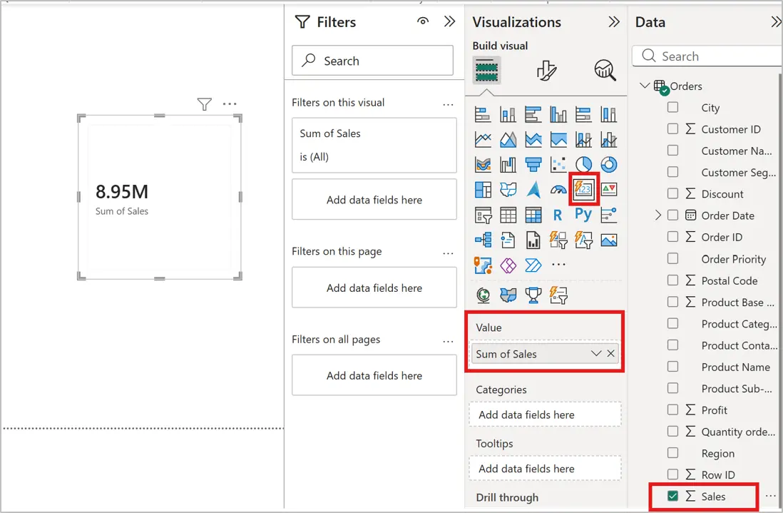
Card visual to show Total Sales
- Select Card visual from the visualization pane.
- Select the Sales field and put it in the Value section to reflect the numbers. You, can also drag and drop the field in the value section.
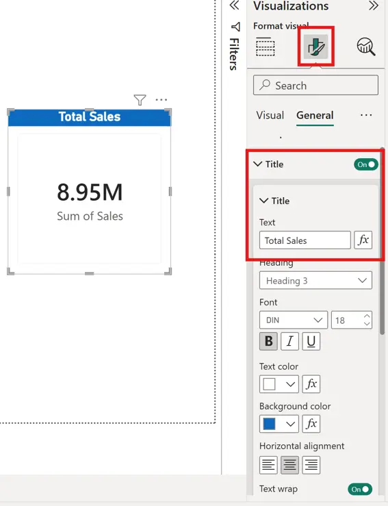
To add title to the visual, use the Format Your Visual option from top under visualization pane.
Similar way you can create more such visuals like:
- Gauge chart to show Total Profit
- Pie chart to show Sales by Customer Segment
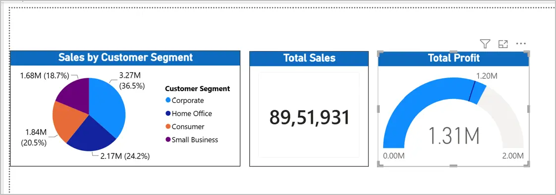
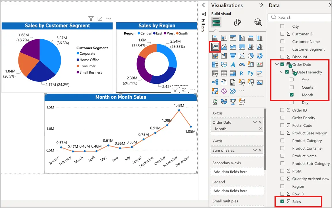
Now, let us create a Line chart to show month on month Sales trend.
Also, we will create a donut chart to show region wise sales and profit.
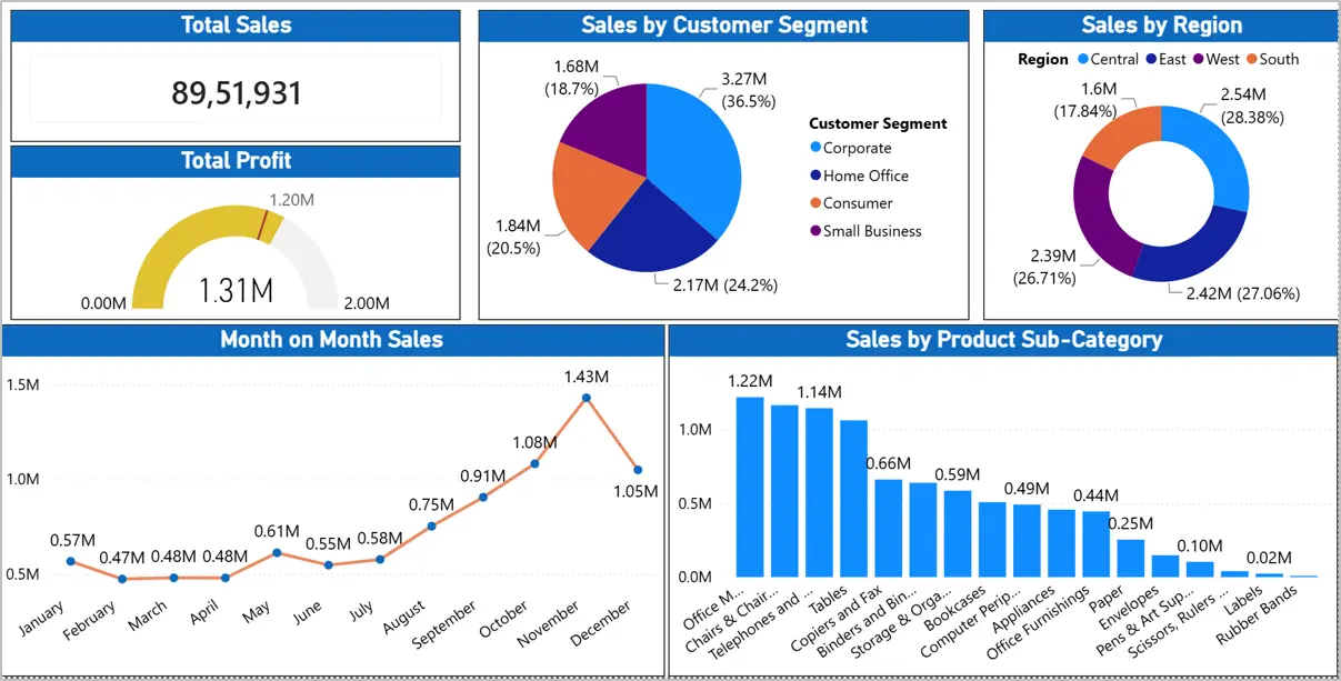
Now, let us create a cluster column chart show casing Sales by Product sub-category.
You can also try creating below to add in your report:
- Sales by Region → Map visual to show Central, East, West performance.
- Profit by Category → Stacked column chart comparing Furniture, Office Supplies, Technology.
- Top Customers → Bar chart ranking customers by sales.
- Order Trends → Line chart showing monthly sales and profit.
Adding Interactivity
To make your report more dynamic:
- Add a Title to the slide.
- Add Slicers for Region, Segment, and Category.
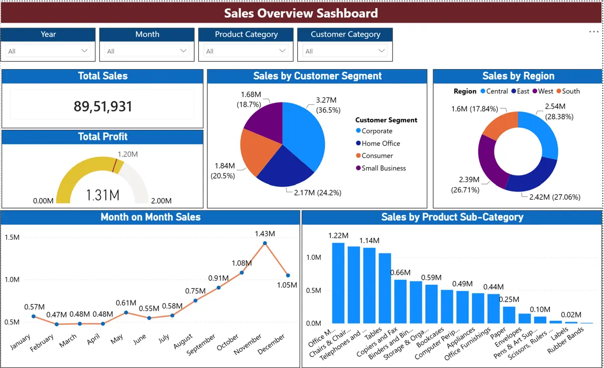
Key Takeaways
By following this guided process, you’ve learned how to:
- Import and explore data.
- Data modelling and building relationships
- Build measures with DAX.
- Create visuals that highlight sales, profit, and customer insights.
- Design an interactive, professional dashboard.
Learning Power BI is not just about building reports and dashboards — it’s about developing a mindset for data-driven storytelling. Every chart you design teaches you how to ask better questions, uncover hidden patterns, and communicate insights with clarity. The more you practice, the more confident you’ll become in transforming raw numbers into meaningful narratives that influence decisions.
Think of Power BI as a canvas: with each report you create, you are painting a clearer picture of the world through data. Keep experimenting, keep refining, and let curiosity guide your journey and take your career to next level.
Power BI Dashboard vs Report: What is the Difference?
Now that you have built a dashboard, it helps to know exactly how it differs from a report. The two terms get used interchangeably, but inside Power BI they are two distinct objects with different jobs.
| Aspect | Report | Dashboard |
|---|---|---|
| Purpose | Built for deep analysis of one connected dataset. A report is where you ask questions of the data and dig into why a number moved. | Built to monitor several metrics at once, often pulled from more than one report or dataset, for a fast status check rather than an investigation. |
| Interactivity | Fully interactive inside its own pages. Slicers, filters, and drill-through all work live, and every visual on the page responds together. | Interactive only at the surface. Clicking a tile opens the source report if you want to dig deeper; the tile itself is closer to a snapshot. |
| Structure | Can span multiple pages inside a single .pbix file, with every page drawing from the same underlying data model. | Lives on a single canvas made up of tiles, each one pinned in from a visual in a report, possibly from several different reports at once. |
| Data Updates | All pages refresh together, on the schedule set for that one dataset, so every visual in the report is always in sync. | Each tile refreshes on the schedule of the report it came from, so a dashboard can quietly display tiles at different levels of freshness. |
| Use Case | Best when you need to explore, for example working out why regional sales dipped in a specific month by slicing the same dataset several ways. | Best when you need a single screen that combines sales, support, and finance tiles for a quick daily read, without opening three separate reports. |
Your Power BI learning path after this tutorial
This introduction gets you to a working report. Here is how to keep progressing. Most learners reach a confident intermediate level in one to two months of regular practice.
Foundation
Get comfortable with the basics you practised here: connecting to Excel, CSV, and SQL data, building bar, line, and table visuals, using slicers and filters, and publishing to the Power BI Service.
Intermediate
Move into the skills that make your reports genuinely useful: Power Query transformations (merge, pivot, group by), basic DAX measures, relationships in the data model, and Row-Level Security. This is the level most working analysts need day to day.
Advanced
Build toward full BI delivery: complex DAX (time intelligence, RANKX, dynamic measures), composite models, deployment pipelines, dataflows, and paginated reports. At this level you can architect and deliver enterprise reporting solutions.
Go from beginner to job-ready with the Power BI Course
This tutorial gets you started. The Techcanvass Power BI Course takes you all the way: structured, project-focused training that turns these basics into real, portfolio-ready skills and prepares you for the PL-300 certification.
The course covers
- Power Query data transformation in depth
- DAX measures and calculated columns
- Data model and semantic model design
- Report design and dashboard storytelling
- Publishing, sharing, and refresh in the Service
- Full PL-300 certification preparation
Go deeper: more Power BI tutorials
Once you have finished this introduction, use these focused guides to build specific skills. Each one picks up where this tutorial leaves off.

Power BI Semantic Model and Connection Modes
Read guide →
Power BI Tips and Tricks for Analysts
Read tips →
How to Optimise Power BI Reports
Optimise →
AI in Power BI Dashboards
Read guide →
Power BI Copilot vs Manual Reporting
Compare →
How to Clear the PL-300 Power BI Exam
Exam guide →
Compare Power BI Certifications: PL-300 vs DP-600
Compare →
What Is Power BI? The Complete Guide
Read the guide →Power BI tutorial: common beginner questions
Practical questions from people working through their first Power BI introduction.
How do I start learning Power BI as a complete beginner?
Start by installing the free Power BI Desktop, then follow a hands-on path: connect to a simple Excel or CSV file, clean it in Power Query, build a bar chart and a slicer, write one basic DAX measure, and publish the report. Building a real report end to end teaches you far faster than reading about features. This tutorial walks through exactly that sequence.
Is Power BI Desktop free to download?
Yes. Power BI Desktop is completely free to download and use on a Windows computer, and it includes everything you need to connect data, build models, and create reports. You only need a paid Power BI Pro or Premium licence when you want to publish reports to the cloud and share them with colleagues.
How long does it take to learn Power BI?
You can build your first working report in under an hour by following this tutorial. Foundation skills take around one to two weeks of practice. Reaching a confident intermediate level, which covers most real reporting work, typically takes one to two months of regular hands-on practice. Advanced skills build over three to six months.
Do I need coding or programming skills to follow this tutorial?
No. The core of Power BI is drag-and-drop, so you can connect data and build interactive reports with no code. DAX, the formula language for custom calculations, looks similar to Excel formulas and you only need a few functions to start. You can follow this entire introduction without any prior programming experience.
What data should I use to practise Power BI?
Any Excel or CSV file with a few columns of real values works well. A simple sales file with date, region, product, and amount columns is ideal because it lets you practise totals, slicers, and time-based DAX. Using data from your own work makes the practice more meaningful and easier to remember.
What should I learn after this Power BI introduction?
After building your first report, move into Power Query transformations, basic DAX measures, and data modelling, then practise Row-Level Security and report optimisation. Use the tutorial hub above to follow focused guides on dashboards, semantic models, and report performance, and consider a structured course to prepare for the PL-300 certification.