Did you know visualization has been in use since (and well before that) 1824 AD to develop an Egyptian map – the Turin Papyrus Map. The Rose map in 1855 by Florence Nightingale, a social reformer, statistician, and founder of modern nursing, is another famous example conveying the avoidable deaths of soldiers by improved sanitization during the Crimean war.
Terabytes and petabytes of data generated every day must be analyzed to get valuable insights. But can you imagine scrolling through this massive amount of data and trying to find trends and patterns? For instance, with the overwhelming volume and rate at which data grows, it is almost impossible to do it without visual help. Every data set tells us some story, but we need practical tools to find and communicate the story’s purpose with the stakeholders.
Data visualization can be pictorially summarized as:
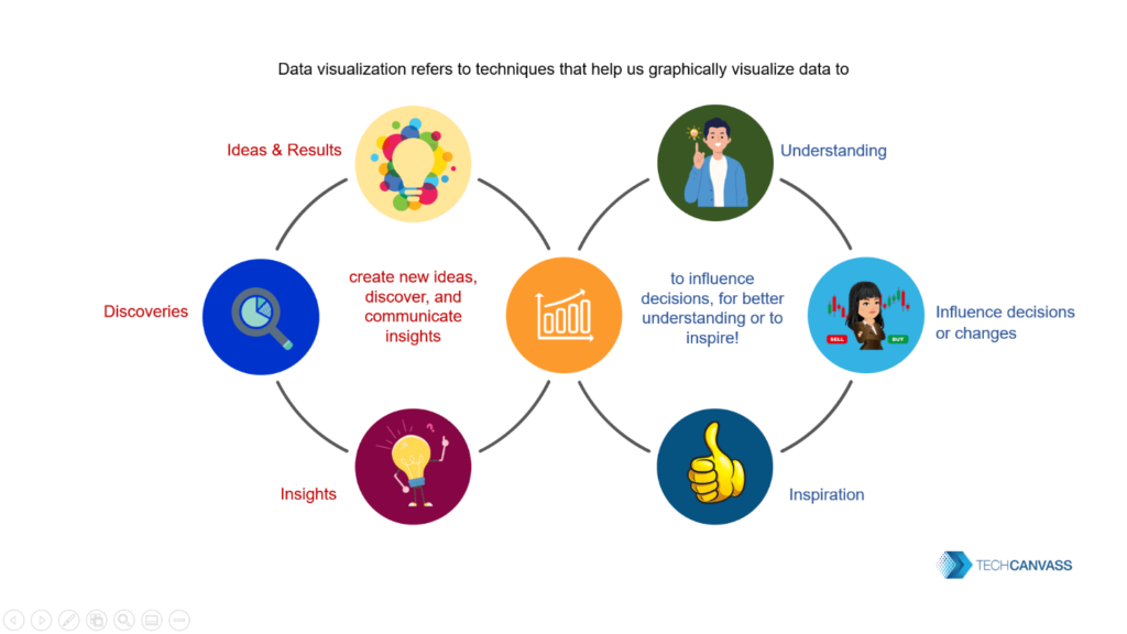
Importance of Data Visualization
- Quick and Easy: Visuals communicate easy-to-understand information precisely.
- Accurate Insights: As we saw in the above example, visuals give us accurate insights from the data helping us form correct decisions.
- Faster Decision-Making: Visuals help us to look at a massive amount of data in a small space, map relationships across variables, identify patterns, highlight outliers, and much more which, leads to faster and accurate decisions than scanning rows and rows of data.
- Dynamic Updates: Instead of creating more and more charts and graphs, we can dynamically change the data selected and see how it changes the graphs by making the visual interactive.
- Spotting Errors: Visuals help identify errors in the data that can be removed to get the right visuals.
- Drill Up and Drill Down: It gives users the control to look at the overall picture by drilling up or go deeper and explore by drilling down.
- Applicable Across Various Sectors: Visuals provide valuable inputs in many different fields: business, crime management, healthcare, education, the public sector, and many more.
Find out Why do Business Analysts need to learn Data visualization skills?
Creating Good Visualizations
Beautiful visuals are no doubt captivating, but they should also be informative, novel, and efficient. Is the visual delivering the intended insight or message, or Is the graph just pretty looking? Aesthetically providing correct context? Easily interpretable and pleasing to the eye, or is it occupying the entire page with multiple messages, over-burdening the user?
A tableau is a leading tool in the market for visual analytics. In other words, A variety of compelling and insightful graphs and stories can be built in Tableau. These visualizations were prepared in Tableau. Check out our Tableau Certification Training developed using industry expertise, real-life case studies, and the best resources to provide an in-depth understanding.
Know the Audience and Keep the Goal in Mind
It is vital to make sure that the story is tailored to suit the audiences’ goals and priorities, expertise, preferences, expectations, and level of detail, keeping in mind their biases and what drives them. Even though this may seem very obvious, it is helpful to comprehensively understand the audience at the beginning for successful communication with data.
- Understanding the audiences’ level of knowledge, the amount of discussion, and what is relevant to them is essential.
- It is vital to ensure that no bias is creeping into the visualizations. It is best to watch out for biases that might cause the storyteller to ignore conflicting information countering their existing opinions.
- Data may reveal many insights, but are they relevant to the goal outlined? Presenting irrelevant information may overburden the audience.
If the audience is mixed, splitting them into smaller groups will help effectively serve each group’s needs. For example, the same story might not appeal to technical and business stakeholders. This can be done based on the insights derived from the data, the recommended action, and the decision-makers.
Choose Appropriate Visuals
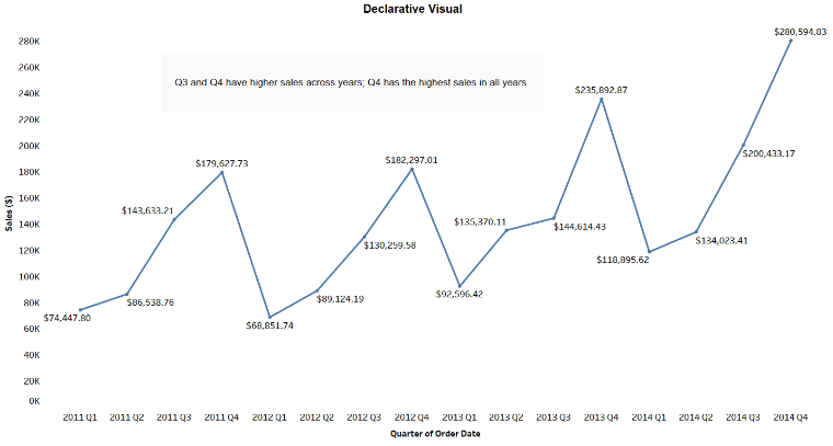
Identify the visual, i.e. declarative or exploratory, the type charts, presentation, etc. It will change based on the type of visual required.
Declarative visuals provide factual information and can be easily understood by basic line, bar, or scatter charts. This chart requires no further explanation.
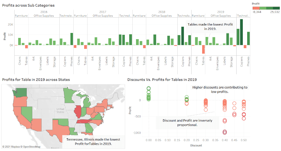
Exploratory visuals explore data to either confirm/reject a hypothesis, find a pattern, or a root cause. This requires in-depth data exploration.
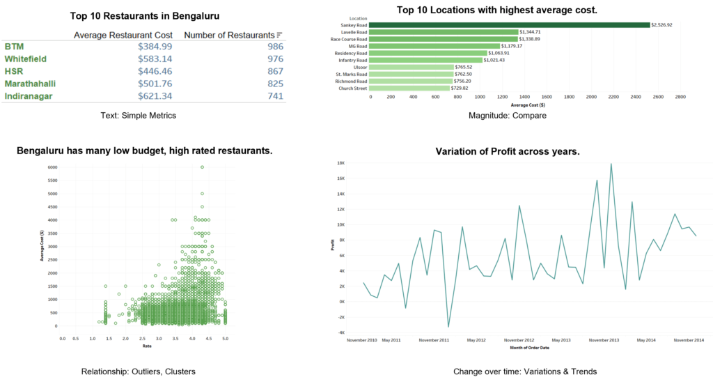
- Several charts and graphs are available, since it might not be obvious which visual to select. The clarity of what needs to be conveyed and each visual’s purpose can help choose appropriate visuals. As a result the selected visuals should accurately and clearly, explain the insights. For example, if the audience does want to go into the details of budget utilization (allocated Vs. spent) of each product sub-category, an aggregated percentage metric for the overall budget is more suitable. Some standard types of visuals can be listed down as:
- Text: To display simple metrics.
- Magnitude: To compare two or more discrete values, you can use bar charts, which are used to compare data across categories. They help us spot the highs, lows and get a general idea about trends due to variations in the values.
- Relationship: A scatter plot can display the relationship between variables and identify outliers and clusters.
- Change over Time: To see how a numeric value changes over time, a line graph, which shows trends of continuous data over time, is helpful.
- Composition: Helps to see what amount of the total is taken up by individual values. An area chart can show the relative sizes of the parts of a whole.
- Distribution: When you want to find the frequency of distribution of values, you can use histograms. The X-axis is divided into a range of numerical bins or time intervals. The Y-axis shows the counts of values for each bin.
- Deviation: You can use bar charts or bullet graphs in order to see how far a value is from a decided baseline.
- Spatial: When you want to display locations on a map using latitudes and longitudes and other values or show movement from one point to another, you can use maps.
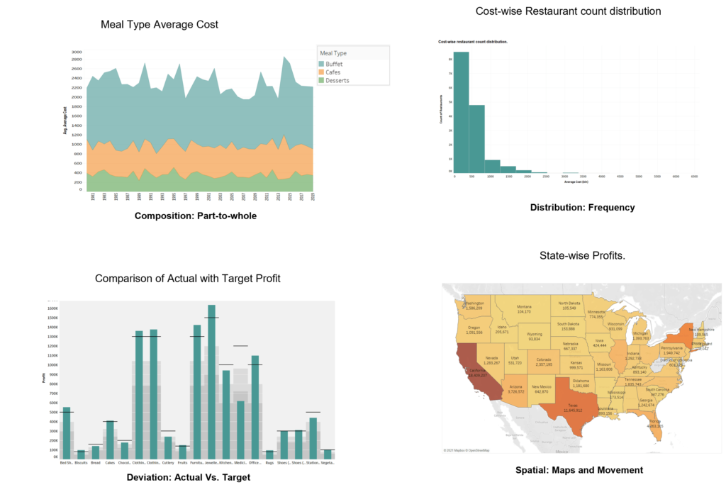
- You can check out more examples Visual Vocabulary.
- Crisp charts, appropriate white space, and less noise will make the graph easy to interpret and bring out actionable insights. Following visual best practices while designing dashboards is essential. Like starting the axis at zero, avoiding 3-D graphs, leverage white space, and consistent use of text and colors.
- The expected outcome also plays a vital role in selecting visuals. Is it a boardroom discussion with senior executives or a one-to-one exchange with your manager, or is it for customers?
- A compelling story, a sequence of visualizations that work together to convey information, works well. An exciting story should tell a data narrative, provide context, demonstrate. It should reflect how decisions relate to outcomes and make a compelling case. No doubt, you need to activate your creative as well as the intellectual side of the brain at the same time while working on data visualization.
- The takeaways should be precise, not complex, and lengthy. They should be simple yet impactful.
About Techcanvass
Techcanvass is an Information Technology certifications training Organization for professionals. It offers internationally recognized certifications in the fields of Project Management and Business Analysis. It is a premier Authorized training partner of Project Management Institute (PMI), USA, and a premier Endorsed Education Provider (EEP) of International Institute of Business Analysis (IIBA), Canada. Founded by IT professionals, We are committed to making learning a more structured, practical, and goal-oriented exercise. We also provide consulting services in the fields of Project management and Business Analysis.


