Best Guide to Area Charts in 2025
What are Area Charts?
Area charts are a mix of two chart types – line and stacked bar charts. The part below a category line fills till the x-axis or the line of the category below it. Area charts help compare trends or proportions of each category or analyze the amount of change over time. They usually help in depicting time relationships and are usually for the plot ordinal data (data having a valid sequence/ordering) and are of two types, continuous and discrete.
Know more about our CBDA Certification Training Course, PowerBI certification program, Data Analytics Certification Training.
Line and Area Charts
Before we look at different types, let us compare a line chart and Area Charts to understand the differences. We will examine a crime data set that reports year-wise cases from 2001 to 2010 for crimes against women, including dowry, cruelty, importation, kidnapping, molestation, and more. By visualizing this data through both a line chart and an Area Charts, we can gain insights into trends and patterns over the years, highlighting the effectiveness of Area Charts in representing cumulative totals and emphasizing the magnitude of change in the data.
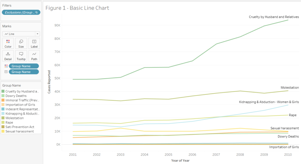
Let us first look at a line chart for 2001 then compare it with an area chart.
In this line chart, we can see that Cruelty by Husband and Relatives for 2001 is represented as a point indicating the number of cases as 49,170. Similarly, Dowry Deaths was 6,851 in 2001, again represented as an individual point. Line charts are usually required for comparisons or visualizing trends between data points.
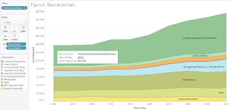
In Figure 2, stacked area charts , we can observe how the area between the lines for different crimes fills till the line of the crime below it. For example, in 2001, Cruelty by Husband and Relatives (49.17K) is stacked on top of Dowry Deaths (6.85K. Similarly, all the number of cases for different crimes are added up in the chart. Here, we get an idea of the total number of crimes in 2001 as well. It shows the totals as well as the relative size of the crimes with respect to others. We can quickly tell that the crime rates for Cruelty by Husband and Relatives increased significantly from 2008 to 2009 compared to others. On the other hand, Cruelty by Husband and Relatives is the most common crime, and the overall crime rate has been increasing across the years.
Thus, we can conclude that line graphs can best see the variability of a measure or variable over time. Area charts helps us see the part-to-whole relationships between two or more different data categories and individual contributions of each category. It helps us see the relative proportions of totals or percentage relationships. Let us look at examples to understand them better.
Area Charts Types
Continuous 100% Stacked
In Figure 2, it becomes difficult to analyze the individual trends of each crime category as, after the trend on the bottom of the stack, all other stacks inherit the trend below.
In this case, 100% stacked charts can be helpful. Here, the y-axis equals 100%, and the individual category is shown as a percentage of the total for each year. It helps to compare the rate of crimes yearly.
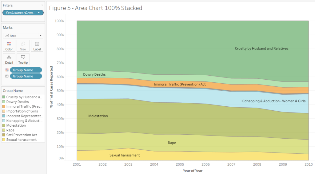
Figure 3 tells us that Cruelty by Husband and Relatives is a frequent crime across the ten years, while Importation of Girls contributed the least.
Continuous Unstacked
When we remove the stack option, the stacks follow the same, and we get an overlapping graph. We get a graph similar to Figure 1, but the area under the lines of shade till the x-axis. Here, we get the exact measurements for each category. We need to increase the opacity to see all the overlapping areas for different categories. It is essential to order the category names in the order of their contribution so that they are not behind larger categories.
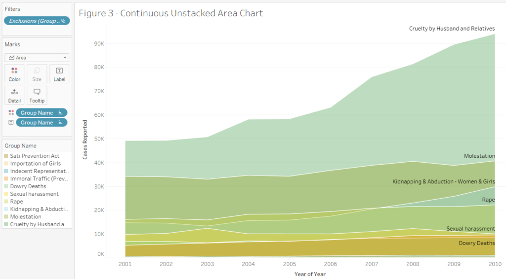
This chart gives us the actual sum for each category of crimes, arranging them in overlaying layers on top of each other. Interestingly, this type gives us the exact contribution of each category and a part to the whole idea with the total.
Discrete
Similar to the line chart, each year is split into discrete date parts (Quarter). We get a clear idea of the overall trend and look at the relative contribution of each category. Let us look at another example data set, which contains data about arrival and departure domestic and international passenger traffic from various terminals from the LA airport from 2006 to 2018.
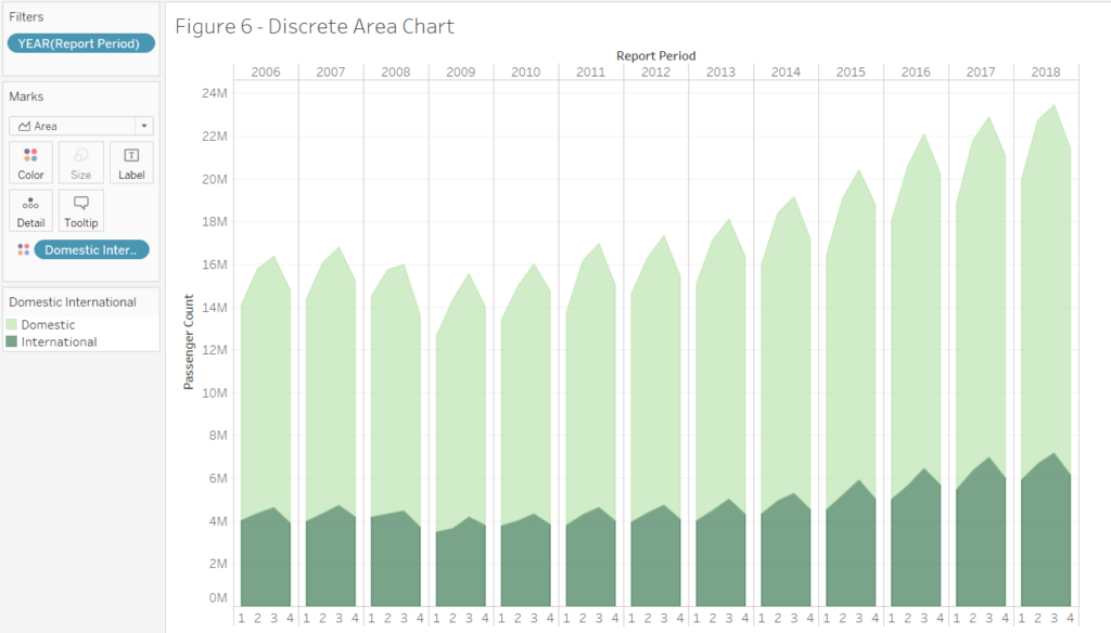
Figure 5 gives us a stacked area chart for the domestic and international passenger traffic split into discrete quarters for the years 2006 to 2018. We can immediately see that domestic passenger traffic has been considerably higher across all years than international traffic. It looks like many US citizens enjoy traveling to and from LA! Q3 consistently has the highest counts for domestic and international travel.
It is not surprising as July, August, and September are summer and vacation seasons contributing to higher trips than winter months of January, February, and March had the lowest counts. Overall the passenger count has increased across the years, more notably for domestic travels.
In conclusion, we can say that area charts are excellent when we want to look at the part-to-whole relationships. It also involves proportion or percentage of total, or change in a variable. One key point to remember is that adding too many groups will clutter your area chart. It renders it powerless to convey insights. Thus, area charts can provide a beautiful representation for different category analyses.

Related blogs by Techcanvass
You can also explore our latest blogs related to Data Storytelling, What Is Data Visualization, Data Analytics Projects Life Cycle, and many more.