What Is Power BI? The Ultimate Guide for Every Professional
People ask me the exact same question every single week. If you are sitting at your desk wondering what is Power BI, you are in the exact right place.

18+ years in Business Intelligence, BI Solution Architecture, and Data Analysis. Certified Oracle DBA, Six Sigma Green Belt, and Tableau Desktop Specialist.

I have been working as a senior data analyst for over a decade. I remember the dark days before modern business intelligence tools existed. We used to spend entire weekends staring at massive, ugly spreadsheets. Our computers would crash because the files were too heavy. We would manually color code rows of data just to show the executive team a basic sales trend. It was absolutely miserable.
Then Microsoft changed the entire game.
Today, data is the most valuable asset in the corporate world. But raw data is completely useless if you cannot understand it. You need a tool to translate the chaos into clear answers. That is exactly what we are going to talk about today.
1. What is Power BI?
At its simplest level, Power BI is a collection of software services, apps, and connectors that work together to turn your unrelated sources of data into coherent, visually immersive, and interactive insights.
The “BI” stands for Business Intelligence.
It sits proudly inside the Microsoft technology stack. This means it talks perfectly with the tools you already use every day. It connects instantly to Microsoft Excel. It works flawlessly with Azure cloud databases. You can even embed its reports directly into Microsoft Teams so your coworkers can see live data during a meeting.
Your data might be sitting in a simple Excel spreadsheet on your local hard drive. It might be sitting in a massive, cloud based data warehouse. Power BI does not care. It lets you easily connect to those data sources, visualize the important metrics, and share that information with anyone you choose. It takes raw data and turns it into gold.
2. Key Components and Features
You cannot just click a single button to master this software. It is actually broken down into several different pieces. You need to understand how the ecosystem fits together before you start building.
The Three Main Environments
Power BI Desktop
This is the heavy lifting tool. It is a free application you install on your Windows computer. This is where analysts spend ninety percent of their time. You use the Desktop version to connect to data, build the complex data models, and create the actual reports.
Power BI Service
This is Microsoft’s secure, cloud-based platform — often referred to as Power BI Online. It is a SaaS i.e., Software as a Service. After building a dashboard on your local computer, you can publish it here to share insights seamlessly with your manager or team, without the hassle of emailing large files.
Power BI Mobile
For executives and professionals on the move, Microsoft provides mobile apps for Windows, iOS, and Android. These apps let business leaders securely access live dashboards anytime, anywhere — whether at the airport, in transit, or between meetings.
The Technical Engine
Power Query
This is your data cleaning machine. Before you can build a chart, you have to clean your messy data. Power Query allows you to filter out bad rows, merge different tables together, and fix broken text formatting.
DAX (Data Analysis Expressions)
This is the mathematical brain of the operation. DAX is a formula language, formally known as Data Analysis Expression. It looks a bit like Excel formulas, but it is much more powerful. You use DAX to create custom calculations like year over year growth or profit margins.
Semantic Model
Formerly known as a dataset, this is the foundational structure created when you connect multiple data tables through relationships. A well-designed semantic model ensures your dashboards are not only accurate but also highly performant — delivering insights at lightning speed. Learn more →
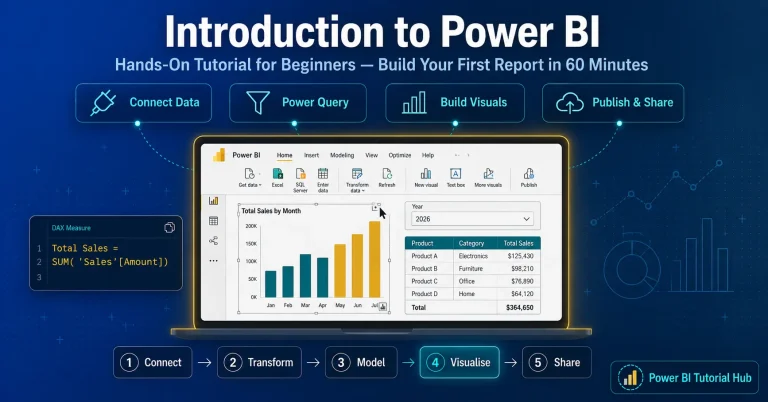
New to Power BI? Start with our hands-on tutorial
Our step-by-step beginner guide walks you through connecting data, building your first model, and publishing a live report.
3. Who Can Use Power BI?
This is the biggest misconception I hear from beginners. People think this software is only for hardcore data analysts or computer programmers or Senior Executives.
That is completely false.
The era of isolated data teams is over. Today, data is democratic. Every single department in a modern company generates massive amounts of data. To advance in your field, you need the ability to analyze your own department’s metrics and turn them into actionable insights.
Here is exactly how different professionals use this tool every single day to make better decisions.
3a. Sales Teams
Sales directors live in a constant state of panic. They always need to know if the team is going to hit the monthly revenue target.
Before modern business intelligence, sales managers would spend hours begging their reps to update a messy pipeline spreadsheet. Now, they use automated dashboards.
A sales professional uses this software to track the entire sales pipeline in real time. They build forecast dashboards to predict future revenue based on historical win rates. They create territory maps to see which geographic regions are performing best. They track individual quota dashboards to see exactly which sales representatives need extra coaching and which ones deserve a massive bonus.
3b. Marketing Departments
Marketing teams spend millions of dollars on digital advertising. If they cannot prove that those advertisements actually generated sales, the CEO will cut their budget entirely.
Marketers use Power BI to prove their worth. They connect the software directly to Google Analytics, Facebook Ads, and their internal CRM system. They build massive campaign ROI dashboards.
With a few clicks, a marketing director can see the entire customer funnel. They can track channel attribution. This means they can see exactly which specific Facebook ad caused a customer to finally buy a product three weeks later. They track web analytics to see where website visitors drop off and abandon their shopping carts. It removes the guessing game from advertising.
3c. Human Resources (HR)
Human resources is no longer just about planning holiday parties and running payroll. Modern HR is a highly strategic, data driven department.
Hiring and training new employees is incredibly expensive. HR professionals use data to protect the company culture and save money. They build complex headcount dashboards to track exactly how the company is growing across different departments.
They heavily track attrition rates. If the engineering department suddenly has a massive spike in employees quitting, the HR dashboard will flag it immediately. They can analyze the recruitment funnel to see how long it takes to hire a new software developer. They even track employee engagement surveys to predict burnout before it actually happens.
3d. Finance Departments
Finance professionals have a deep, emotional attachment to Microsoft Excel. But even the best financial analysts hit a wall when their spreadsheets get too massive to open.
Finance teams are rapidly migrating to Power BI to handle complex reporting without crashing their computers. They build automated Profit and Loss (P&L) statements that update themselves every single night.
They use the software to track budget versus actuals. This means they can instantly see if the marketing department is spending more money than they were allocated for the quarter. They build cash flow dashboards to ensure the company always has enough money in the bank to make payroll. They run complex variance analysis to explain exactly why revenue dropped in a specific month. It gives the CFO total peace of mind.
3e. Operations and Supply Chain
If you work in logistics, supply chain, or warehouse operations, you know that a single delay can cost a company millions of dollars. Operations managers do not have time to look at historical data. They need to know what is happening right this very second.
Operations teams use this tool for real time monitoring. They build dashboards to track warehouse inventory levels across the globe. If a specific product is running low in the Chicago warehouse, the dashboard turns red.
They track Service Level Agreements (SLA) to make sure delivery drivers are dropping off packages on time. They measure factory throughput to see exactly how many products are being manufactured per hour. It allows supply chain leaders to fix bottlenecks before the customer even notices a delay.
Predictive Analysis
Beyond monitoring, Power BI integrates with AI models to forecast demand, anticipate supply shortages, and recommend corrective actions before issues occur.
Supplier Performance
Dashboards can track vendor reliability, lead times, and defect rates, helping procurement teams negotiate better contracts and ensure supply chain resilience.
Cost Optimization
By combining logistics, procurement, and production data, Power BI highlights inefficiencies — such as high transport costs or underutilized warehouse space — enabling leaders to cut expenses without compromising service.
3f. Business and Data Analysts
This is my territory. If you actually want the official job title of Data Analyst or Business Analyst, this software is your absolute bread and butter. It is the strongest tool in your entire toolkit.
As a business analyst, you sit between the business executives and the software engineers. You use this software for intense requirements validation. When a stakeholder asks a vague question, you dive into the data model to find the actual truth.
You build the master KPI reporting dashboards that the entire company relies on. You spend your day in the BA workflow. This means you extract raw data, you write the complex DAX formulas that the business users do not know how to write, and you design intuitive, beautiful reports. You act as the ultimate source of truth for the entire organization.
See real Power BI dashboard examples
Explore practical dashboard examples built for analysts across industries.
3g. Product Managers and Executives
Leaders don’t have time to sift through rows of raw data. Power BI transforms complex datasets into clear, visual summaries that highlight what truly matters — enabling quick, confident decision-making.
CEOs and executives rely on high-level scorecards that summarize company health. On a tablet or phone, they can instantly see revenue growth (green arrow), customer churn (red arrow), and expense trends (yellow arrow). These visual cues guide strategic direction at a glance. Power BI connects departmental metrics to corporate goals. Executives can see how marketing campaigns, product launches, or operational changes contribute to overall strategy.
Product managers use Power BI to oversee the entire lifecycle — from development to adoption. Dashboards reveal whether customers are engaging with new features, helping managers validate ROI and prioritize future enhancements.
Beyond adoption, dashboards can track customer satisfaction, retention, and churn drivers. This helps leaders understand not just what is happening, but why. Executives monitor profitability, revenue streams, and cost in real time. Power BI integrates with ERP and CRM systems to provide a consolidated view of financial health.
With predictive analytics, leaders can simulate “what-if” scenarios — such as the impact of a price change or market expansion — before making high-stakes decisions. Instead of static slide decks, executives present live dashboards in board meetings. This ensures discussions are based on the latest data, not outdated reports.
4. Is Power BI Worth Learning Today?
I hear this question a lot lately. People see the rise of artificial intelligence and they panic. They wonder if learning a business intelligence tool is a waste of time. They think an AI bot is just going to build all the dashboards automatically in the future.
Let me give you the honest truth. Yes, it is absolutely worth learning. In fact, it is more important now than it has ever been.
Microsoft is integrating AI directly into the software. They call it Copilot. Copilot can help you write a formula faster or automatically generate a basic bar chart. But an AI cannot sit in a boardroom and understand the complex political nuances of your specific company. An AI does not know that the sales director defines revenue slightly differently than the finance director.
The future of Power BI relies entirely on human logic. You still have to build the foundational data model. If you build a bad semantic model, the AI will just confidently spit out the wrong answers.
The career value of this skill is massive. The demand for professionals who actually understand data modeling is skyrocketing. Companies have more data than ever before, but they still lack people who can make sense of it. Adding this specific skill to your resume instantly makes you a more valuable asset, regardless of what department you work in.
See Power BI with AI in action
Read our deep-dive on AI-powered dashboards and Copilot features.
Copilot vs manual reporting
Compare Copilot-generated reports against manually built ones.
5. How to Get Started and Learn Power BI
If you are ready to take the leap, you need a strategy. Do not just open the software and start clicking random buttons. You will get frustrated and quit within an hour.
You also should not rely entirely on random, ten minute video tutorials. Scattered tutorials will teach you how to build a basic chart, but they will completely skip the hard parts. They will not teach you how to clean messy data in Power Query. They will not teach you how to write proper DAX code. They will not explain which visuals to choose in which scenarios etc.
You need structured, professional guidance. You need to learn the underlying rules of business intelligence before you start building reports.
If you are serious about mastering this tool and actually getting hired in the tech industry, I highly recommend enrolling in a formal training program. Taking a comprehensive Power BI Course is the fastest way to bridge the gap between being a confused beginner and a highly paid professional. A good course will force you to work with real world, messy datasets. It will teach you the exact frameworks that senior analysts use in the corporate world every single day.
Stop guessing. Get proper training, build a portfolio of impressive dashboards, and watch your career opportunities explode.
Master Power BI with the Techcanvass Power BI Course
Enrolling in a formal training program is the fastest way to bridge the gap between being a confused beginner and a highly paid professional. Work with real world, messy datasets and learn the exact frameworks senior analysts use every day.
What you will master
- Connecting to real world, messy datasets
- Cleaning data in Power Query
- Writing proper DAX code
- Choosing the right visuals for each scenario
- Building a portfolio of impressive dashboards
- The frameworks senior analysts use daily
Related Power BI Guides
This master guide connects to a full library of Power BI resources. Explore the spokes that match your current stage and goals.

Power BI Tutorial for Beginners
Start learning →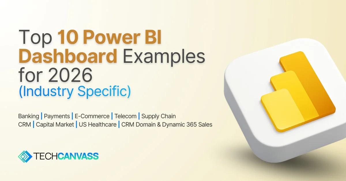
Power BI Dashboard Examples
See examples →
AI in Power BI Dashboards
Read guide →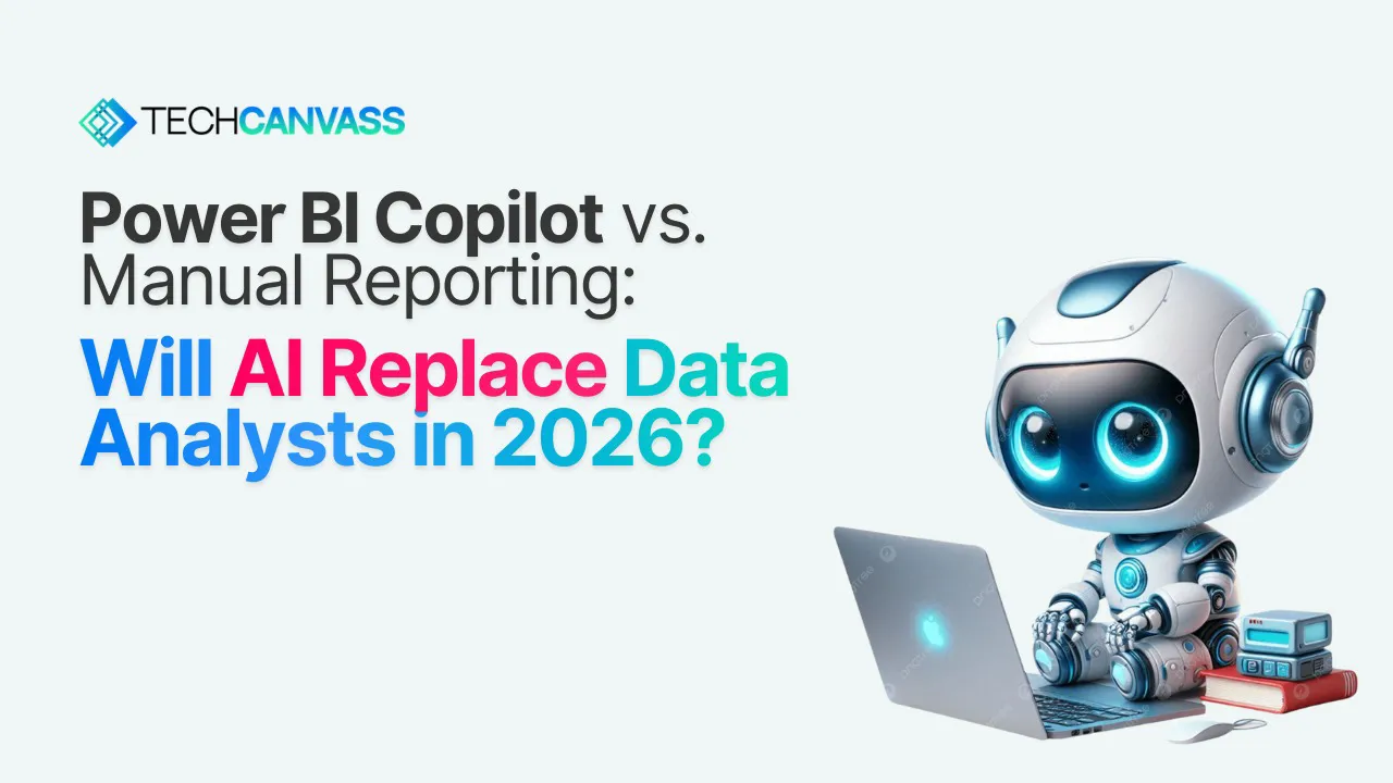
Power BI Copilot vs Manual Reporting
Compare →
Power BI Semantic Model and Connection Modes
Read guide →
Power BI Tips and Tricks for Analysts
Read tips →
How to Clear the PL-300 Power BI Exam
Exam guide →
Compare Power BI Certifications: PL-300 vs DP-600
Compare →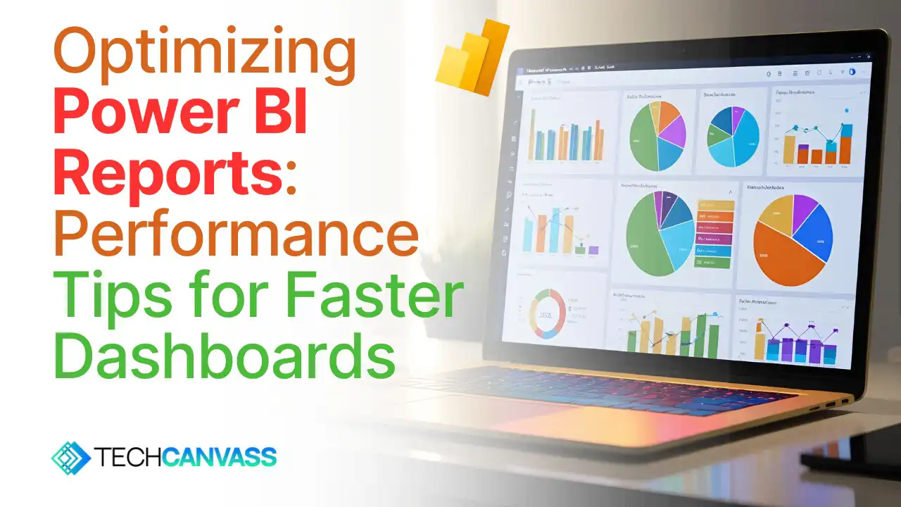
How to Optimise Power BI Reports
Optimize →6. Frequently Asked Questions (FAQ)
When beginners first approach this software, they usually have the exact same core questions. I have compiled the most common questions I get from junior analysts to help clear up the confusion.
What is Power BI primarily used for?
It is used for turning messy, unrelated sources of data into clean, interactive visual reports. Companies use it to track their financial performance, monitor sales metrics, and uncover hidden business trends. It replaces static, boring Excel spreadsheets with dynamic dashboards that update automatically.
Is the software totally free to use?
Yes and no. The main development application, Power BI Desktop, is completely free to download and use on your personal Windows computer. You can learn the software and build complex models without paying a dime. However, if you want to publish those reports to the cloud and share them securely with your coworkers, your company will need to pay for a Pro or Premium license.
Who exactly should learn this software?
Anyone who touches data in their daily job should learn the basics. You do not have to be a full time data analyst. If you are a marketing manager trying to track ad spend, an HR director tracking employee retention, or a financial analyst building profit models, this tool will save you hundreds of hours of manual labour every year. Anyone who is starting his career or having decades of industry experience can learn this tool.
What is the difference between the PL-300 and DP-600 certifications?
This is a great technical question for those looking to get certified. The PL-300 is the Microsoft Power BI Data Analyst certification. This is the core exam. It focuses entirely on building data models, writing DAX, creating visualizations, and deploying reports. If you want to be a business analyst or a data analyst, this is the exact certification you need to pursue. The DP-600 is the Microsoft Fabric Analytics Engineer certification. This is a much more advanced, highly technical exam. It covers the broader Microsoft Fabric ecosystem. It dives deep into massive data lakehouses, complex data engineering pipelines, and advanced analytics. You should only pursue the DP-600 after you have completely mastered the core skills covered in the PL-300 exam.