| Key Facts | Details |
|---|---|
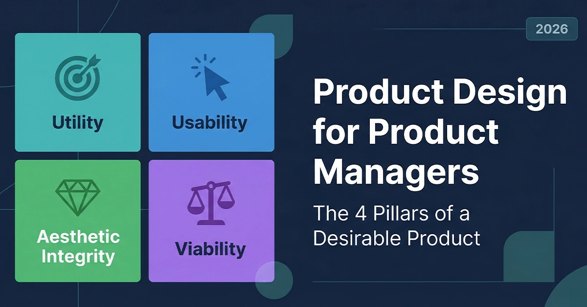
| Framework name | The 4 Pillars of a Desirable Product |
| The 4 Pillars | Utility, Usability, Aesthetic Integrity, Viability and Feasibility |
| Core concept | Product design is not about aesthetics alone — it is a framework for making products people cannot stop using |
| Key frameworks covered | Jobs to Be Done (JTBD), Aesthetic-Usability Effect, Iron Triangle, Mental Models |
| Who this guide is for | Product Managers, Associate PMs, BAs transitioning to PM roles, Product Designers working with PMs |
| Real examples used | Bloomberg Terminal, Amazon Buy Now, Linear, Craigslist |
| PM deliverable | 4-pillar design audit checklist for use in design review sessions |
| Last updated | March 2026 |
Introduction
A product team can spend six months building a feature that looks flawless in Figma, passes every QA test, and ships on schedule — only to receive complete silence from users. The code works. The spec was met. But nobody uses it.
The gap between a technically correct product and one that users actually love comes down to product design. Not aesthetics — the full system of decisions that determines whether a product delivers value, earns trust, and sustains a business.
For many Product Managers, product design is a black box: requirements go in, pretty screens come out. But understanding product design for product managers means understanding the mechanics of desirability — the framework that separates products people adopt from products people abandon.
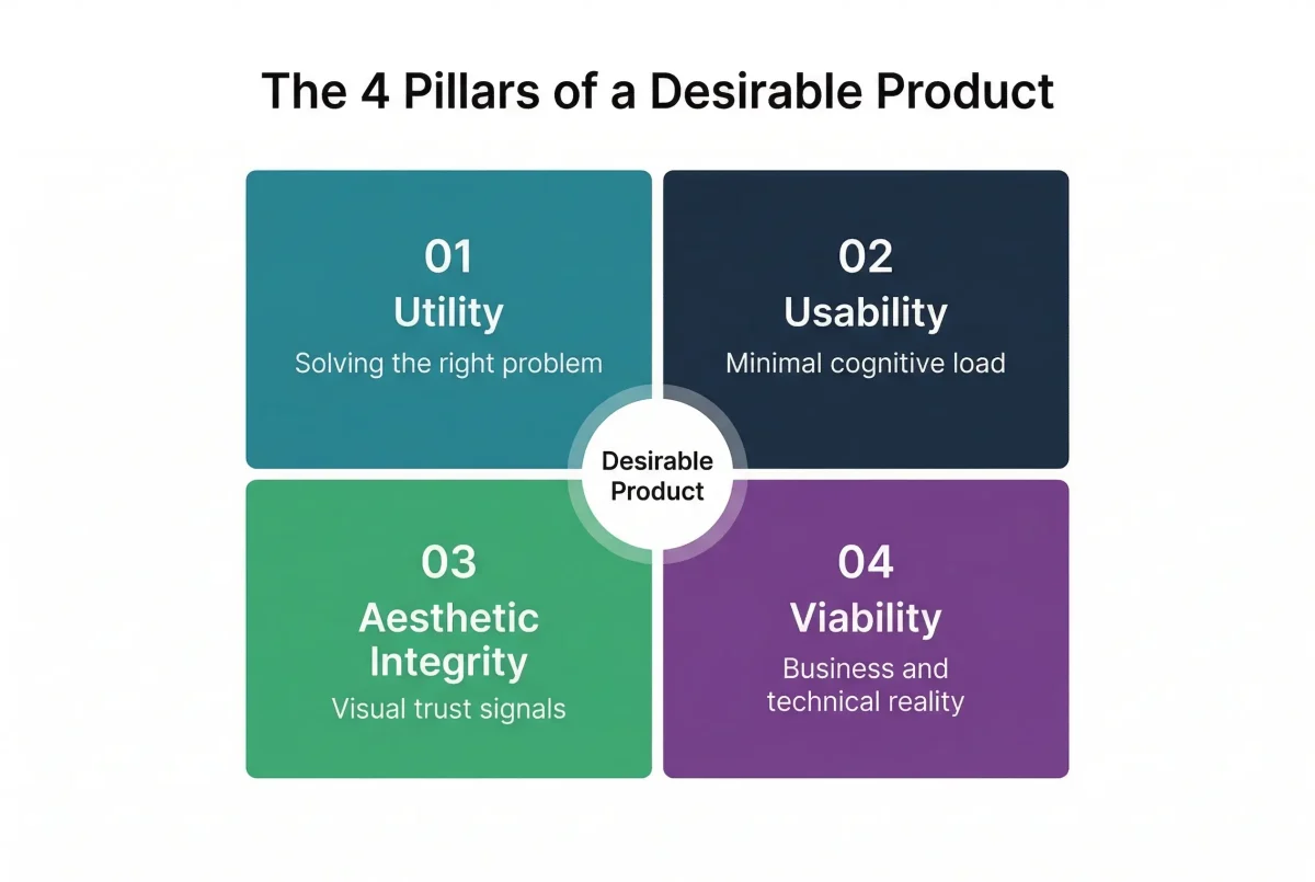
This is where design thinking and product management converge. In this guide, we cover the four pillars every PM needs to evaluate in every design review: Utility, Usability, Aesthetic Integrity, and Viability. We also give you a practical audit checklist you can use immediately.
Pillar 1: Utility — The Foundation of Product Design for Product Managers
Utility is the ‘Does this actually solve something?’ check. It is the most foundational pillar because no amount of visual polish can save a product that nobody needs.
The Jobs to Be Done (JTBD) framework gives PMs the right lens here. Users do not hire a product for its features — they hire it to accomplish a specific outcome. The classic JTBD example captures this perfectly: a user does not buy a quarter-inch drill. They buy a quarter-inch hole. If your product does not provide that outcome, it is just digital noise, regardless of how well-designed the interface looks.
The Bloomberg Terminal: When Utility Beats Everything Else
Bloomberg Terminal is the defining case study for raw utility overriding all other product design considerations. For anyone outside high-frequency trading, the interface looks like an artifact from 1985. By any modern product design standard, it is a visual disaster. There is no onboarding flow, no progressive disclosure, no aesthetic integrity to speak of.
But its utility is unmatched. For a high-frequency trader, it delivers real-time market data, lightning-fast execution, and access to a closed professional network that exists nowhere else. Users pay $24,000 per year for it — and they do not care about the UI. What they care about is that it solves their high-stakes, time-sensitive problem faster than any alternative. That is the power of utility done right.
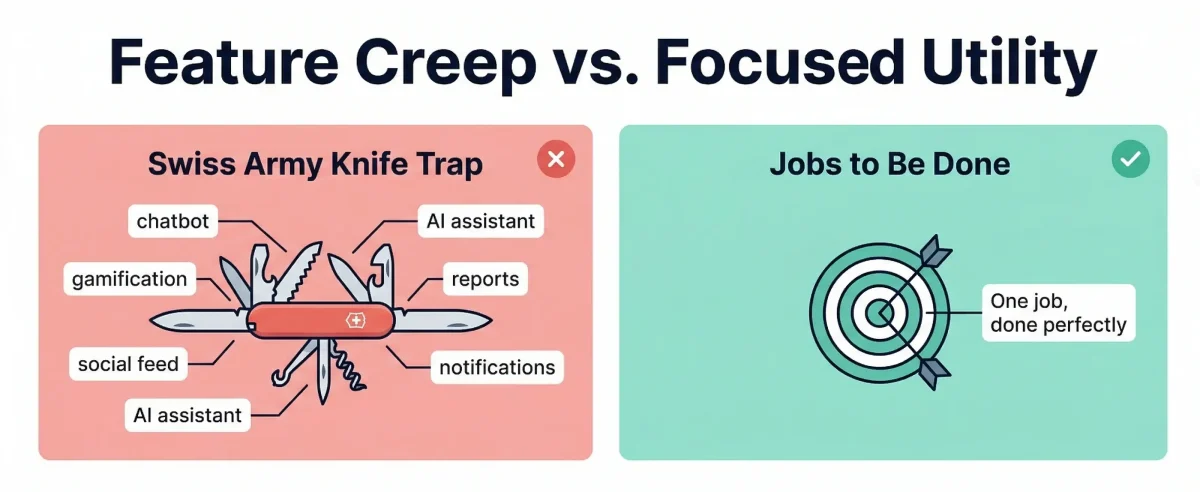
Why Product Managers Fail at Utility: The Swiss Army Knife Trap
Most PMs fail at the utility pillar not because they do not understand it, but because they confuse features with outcomes. A competitor ships a chatbot, so we add a chatbot. A trend toward gamification appears, so we add a points system. This pattern has a name: feature creep driven by competitive anxiety rather than user need.
The result is the Swiss Army Knife trap. A Swiss Army Knife is technically capable of many things, but when you need to cut a steak, you reach for the kitchen knife designed specifically for that task. A product optimised for too many jobs ends up performing none of them exceptionally well.
- Related: If you want to see how top PMs avoid this trap in their roadmaps, see our guide on outcome-driven product metrics.
PM Tip: Ask your team before every design review: ‘Would the user get the result they want if we stripped away all visual design and left only the core functionality?’ If the answer is no, you have not yet defined the right product.
Pillar 2: Usability — Reducing Cognitive Load in Product Design
If Utility is the what, Usability is the how — specifically, how much cognitive load a user must spend to reach the value your product promises.
As Product Managers, we consistently overestimate our users’ patience. We live in the product 40 hours a week. Our users might interact with it for 40 seconds. If they have to think hard about how to navigate it, you have already lost them — not to a competitor, but to inertia. They simply stop.
Amazon and the Science of Removing Friction Points
The gold standard for usability in product design remains Amazon’s one-click purchase flow. Every step in a traditional online checkout is a friction point: finding your wallet, typing 16 digits, entering the expiry date, recalling the CVV, confirming the delivery address. Each step is a moment where the user’s brain can register doubt, hesitation, or inconvenience — and they can abandon.
Amazon identified every one of those steps as an opportunity for drop-off and eliminated them. By collapsing the entire purchase process into a single tap, they made the experience so frictionless that the brain does not have time to register the financial pain of spending money. That is world-class usability — not just fast, but cognitively invisible.
Mental Models and Why Innovation Should Not Touch Standard Patterns
A common mistake among junior PMs and designers is trying to reinvent standard interface interactions. A unique icon for Settings. A novel navigation pattern for the main menu. A creative alternative to the standard search bar.
This is the wrong place to innovate. Usability depends on mental models — the cognitive shortcuts users have built over years of product experience. A magnifying glass means Search. A gear means Settings. A hamburger menu means navigation. When you break these conventions, you increase cognitive load without adding value.
- Related: For PMs preparing to articulate usability requirements in interviews, see our guide on product manager interview questions.
PM Tip: Innovate on your core value proposition. Use established UX patterns for everything else. Reserve creative decisions for the interactions that are genuinely unique to your product’s value — not for navigation, settings, and confirmation flows that users already know how to use.
Pillar 3: Aesthetic Integrity — Why Product Design Aesthetics Are a Trust Signal
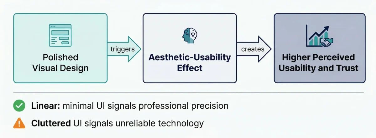
This is the pillar where Product Managers tend to get uncomfortable. PMs are trained to prefer data, frameworks, and measurable outcomes. Aesthetics seems subjective, qualitative, and outside the PM’s domain. That is a mistake.
Here is the documented reality: users perceive more attractive products as more usable. This is the Aesthetic-Usability Effect — a well-researched psychological phenomenon where visual quality directly shapes perceived functional quality. When a product looks polished, users are more forgiving of minor bugs, slower load times, and occasional errors. When it looks dated or cheap, they assume the underlying technology is unreliable.
Linear vs Jira: How Aesthetic Integrity Can Reshape a Market
For years, Jira dominated project and issue tracking through sheer utility. It is powerful, deeply integrated, and feature-rich. But using it feels like a chore. The interface is dense, the visual hierarchy is unclear, and the cognitive load of navigating it is high.
Linear entered the market with a focused investment in aesthetic integrity — sleek dark modes, keyboard shortcuts that feel crisp and intentional, and a minimalist UI that communicates precision and care. Software engineers, a notoriously demanding user group, adopted it rapidly.
Why? Because the aesthetic integrity of Linear acted as a trust signal. The product felt like a precision instrument built by people who cared about their craft. Jira felt like a cluttered legacy database. The underlying utility gap was not vast — but the aesthetic gap was decisive.
Aesthetic Integrity in Fintech and Healthcare: Not Optional
In regulated sectors like Fintech and Healthcare, aesthetic integrity moves from being a differentiator to a baseline requirement. If you are asking a user to link their bank account to your app, and your interface has misaligned text, inconsistent button styles, and low-resolution icons, they will delete the app. Not because the code is insecure, but because the visual hygiene signals a lack of professional rigour.
- Related: For PMs working in regulated industries, see our guide on how AI is reshaping product management in 2026, including compliance-aware design considerations.
In these sectors, users cannot see the code, the security certificates, or the compliance certifications. What they can see is whether the product looks like it was built by professionals who care about details. Aesthetic integrity is how trust is communicated before trust can be earned.
Pillar 4: Viability and Feasibility — Where Product Design Meets Business Reality
This is where the Product Manager truly earns their position in the room. A designer’s job is to push for the best possible user experience. An engineer’s job is to build a stable, scalable, maintainable system. Your job — the PM’s job — is to make sure the proposed design is both viable (it makes business sense) and feasible (it can actually be built within real constraints).
The Iron Triangle of Product Design Constraints
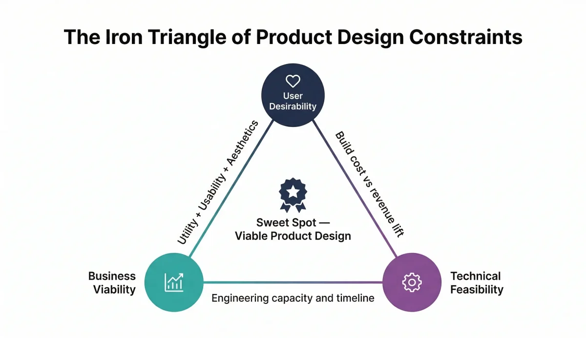
A seasoned Product Manager evaluates every design decision through what we call the Iron Triangle of constraints:
- Business Viability: Does this design create or reinforce the user behaviours that generate revenue, improve retention, or advance a strategic objective? A design that users love but that destroys unit economics is not viable.
- Technical Feasibility: Can the engineering team build this within the available time, talent, and architectural constraints — without accumulating technical debt that will slow every future sprint? Great design on paper is worthless if it requires 18 months of engineering work for a 6-month roadmap.
- User Desirability: Do the first three pillars — Utility, Usability, and Aesthetic Integrity — work together coherently in this design? Viability and feasibility constraints should shape design decisions, not override them entirely.
- Related: For a deeper look at how PMs balance business outcomes with user needs, see our guide on outcome-driven innovation and metrics.
The PM’s role is not to compromise between these three. It is to find the design decision that satisfies all three simultaneously — or to make a documented, transparent trade-off when that is genuinely impossible within the current cycle.
Are you a Business Analyst looking to move into Product Management?
Techcanvass offers a structured Product Management Course designed specifically for BA professionals making the transition. You will learn roadmapping, design frameworks, stakeholder management, and how to use AI tools in modern PM workflows.
Balancing the 4 Pillars — The Core Challenge of Product Design
Understanding each pillar individually is the beginning. The real skill in product design for product managers is knowing how to balance them — because the four pillars are almost always in tension with each other.
| Pillar | Core Focus | The Conflict You Must Manage |
|---|---|---|
| Utility | Solving the right user problem | Can trigger feature creep, which directly increases cognitive load and hurts Usability |
| Usability | Minimal cognitive load, maximum ease | Over-simplification can strip away power-user functionality, reducing Utility for advanced segments |
| Aesthetic Integrity | Visual trust signals and polish | High-quality design is expensive and slow — over-investing here directly threatens Feasibility and time-to-market |
| Viability and Feasibility | Business and technical reality | Prioritising constraints too heavily produces commodity, uninspired products that fail on Aesthetic Integrity and Usability |
The MVP Bet: Choosing Your Lead Pillar
When launching an MVP, you are making an explicit strategic bet on which pillar matters most for your specific market context. There is no universal right answer — but there are two clear archetypes:
Utility-First MVP: Launch a clunky but deeply valuable tool that solves a massive, underserved pain point. Early Craigslist. Early Slack (which began as an internal gaming tool with no consumer polish). The bet: utility is so rare and so high that users will overlook aesthetic and usability shortcomings long enough to validate product-market fit.
Aesthetic-First MVP: Launch in a saturated market where the core utility is already commoditised — a new to-do app, a new calendar tool, a new project management product. Here you must lead with aesthetics and usability to differentiate, because functional parity with existing products is the floor, not the ceiling.
The most common MVP failure mode: choosing a utility-first approach in a market where the utility problem is already solved, or choosing an aesthetic-first approach for a problem where users are so desperate for any solution that they do not care what it looks like.
- Related: For PMs who want to learn how to write the PRD that bridges design decisions with engineering requirements, see our step-by-step guide.
How to Run a Product Design Audit: The 4-Pillar Checklist for Product Managers
As a Product Manager, you do not need to be able to create in Figma. But you should be able to run a structured product design audit using these four pillars as your evaluation framework. Use this checklist in every design review session to keep decisions grounded in evidence rather than opinion or authority.
PM Design Audit Checklist
- Related: If you are preparing to discuss product design decisions in a PM job interview, see our complete guide to product manager interview questions with worked examples and frameworks.
Want to use AI to speed up your design review process?
Our guide on how smart Product Managers use Generative AI covers specific prompts and workflows for using AI tools to validate product decisions, write design audit notes, and draft PRD sections — faster than traditional methods.
The Ultimate Goal: Making Product Design Invisible
At the end of every design review, a Product Manager is making resource allocation decisions. Every engineering hour spent on a non-essential animation or an over-engineered component interaction is an hour not spent on a critical bug fix, a performance optimisation, or a feature that moves the North Star metric.
The 4-pillar framework for product design gives PMs something more valuable than an opinion: a language for saying no. ‘No’ to the beautiful but useless feature. ‘Yes’ to the unsexy but high-utility improvement that compounds into sustainable product-led growth.
The most successful products in the world — Google Search, Spotify, WhatsApp — are not products people notice. They are products people use. The design has become invisible because the utility is perfect, the usability is seamless, the aesthetics are trustworthy, and the business model is sustainable. When a user says ‘I cannot imagine not having this,’ the PM has balanced all four pillars successfully.
That invisibility is the North Star of great product design. Work backwards from it in every decision you make.
Four questions to carry into every design review:
- Related: For a complete career roadmap from Business Analyst to Product Manager, including the design skills BAs need to develop, see our 2026 transition guide.
Frequently Asked Questions: Product Design for Product Managers
The 4 pillars are Utility (does the product solve the right problem?), Usability (can users get value with minimal cognitive effort?), Aesthetic Integrity (does the visual quality build user trust?), and Viability and Feasibility (can the business actually build and sustain it?).
Together, these four pillars form a framework for evaluating any product design decision. The PM’s job is to balance all four pillars so that the design serves users, the business, and the engineering team simultaneously.
Utility answers the question: does this product solve a real problem? Usability answers: can users access that solution with minimal effort and cognitive load?
A product can have high utility but poor usability (like Bloomberg Terminal), or excellent usability but low utility. The ideal product design scores strongly on both: it solves a genuine, important problem in a way that requires minimal mental energy from the user.
The Aesthetic-Usability Effect is a psychological phenomenon where users perceive visually attractive products as being more functional and easier to use. A polished design builds user trust and tolerance; users are more forgiving of minor bugs or performance issues in products that look professionally designed.
JTBD focuses on understanding the specific outcome a user is trying to achieve — the ‘job’ they are hiring a product to do. Example: a user doesn’t buy a drill; they ‘hire’ it to do the job of making a hole in the wall. This keeps teams focused on outcomes rather than features, preventing feature creep.
A PM evaluates design using a structured 4-pillar audit: Utility Test (solve the right JTBD?), Usability Test (complete core task in < 30s?), Aesthetic Integrity Test (visual match for trust?), and Viability/Feasibility Test (buildable within constraints?). This elevates discussions above subjective opinions.
The Iron Triangle refers to three simultaneous constraints: Business Viability (revenue/strategy), Technical Feasibility (available talent/tech), and User Desirability (Utility/Usability/Aesthetics). PMs must manage trade-offs between these three inflexible constraints.
Yes. BA skills transfer directly: requirements gathering maps to Utility, user acceptance testing to Usability, and stakeholder communication to Viability. Learning these frameworks strengthens a BA’s ability to contribute to strategy and eases the transition to PM roles.