Top 10 Power BI Dashboard Examples for 2026 (Industry Specific)
Listen to this article as a podcast
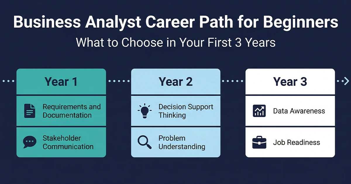
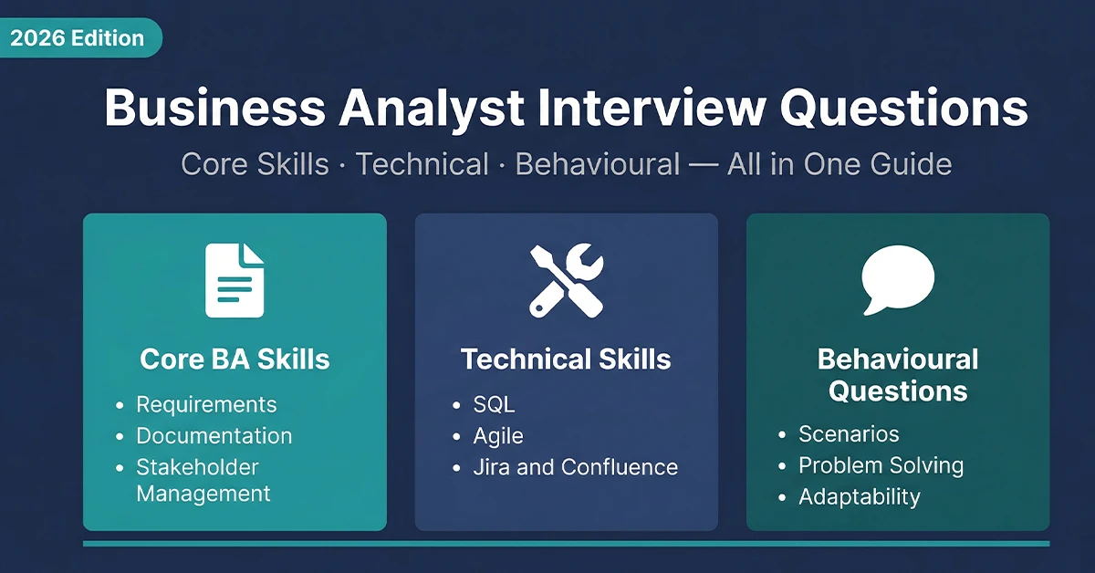
Table of Contents
It’s 2026, and let’s be honest: if your reports still look like colorful spreadsheets, you are falling behind. The definition of a high-quality Power BI dashboard has completely shifted. We aren’t just tasked with reporting history anymore; stakeholders now expect robust business intelligence that predicts the future.
As organizations settle into the Microsoft Fabric ecosystem, dashboards have morphed from passive screens into active interactive reports. Whether you are a Business Analyst fighting scope creep or a Supply Chain Manager trying to untangle a logistics knot, knowing how to master this new wave of data visualization is the skill that will define your year.
In this post, I’m going to walk you through ten industry-specific power bi dashboard examples that are setting the standard right now. We’ll look at the specific key performance indicators (KPIs) that actually matter and how to structure your visual analytics for maximum impact.
What Makes a Great Power BI Dashboard?
A great dashboard isn’t just about pretty charts; it’s about data storytelling. It needs to answer the question “So what?” before the user even asks it. In the high-pressure environment of modern data analytics, clarity is king.
-
Cut the Clutter
If a metric doesn’t help me make a decision, get it off the canvas. We call this avoiding “chart junk” to improve report usability.
-
Speak the Same Language
“Revenue” needs to mean the same thing to Sales as it does to Finance. Implementing standard semantic models is your best friend here.
-
Design it Like an App
Users shouldn’t need a manual to navigate your report. Use bookmarks, buttons, and clear flows to create a seamless user experience (UX).
-
Drive Action
Don’t just tell me sales are down. Give me the drill-through capability to see exactly which region is responsible and the contact info of the manager to fix it. This is actionable intelligence at its best.
The Evolution of BI in 2026
Before we jump into the examples, have you noticed how different BI tools look lately? The “fruit salad” era of bright, clashing colors is thankfully over. The modern aesthetic is sleek, dark, and incredibly focused.
We are seeing a huge push for Minimalism & Dark Mode to reduce eye strain. AI-Driven Narratives are popping up everywhere, with Copilot summaries saving us from reading simplified tables. And most importantly, we’ve moved to Predictive Analytics—shifting the conversation from “what did we sell?” to “what will we sell next quarter?”
Recommended Certification Courses
Here is how these trends look in practice across ten key industries.
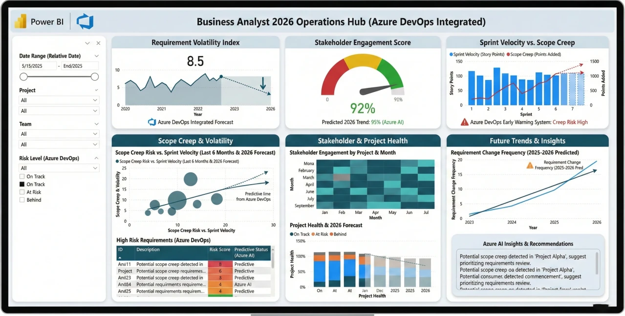
1. Business Analyst: Stakeholder & Requirements Tracker
If you’re a BA, you know the pain of requirements changing mid-sprint. A simple task list just doesn’t cut it anymore. You need a strategic project dashboard that links moving parts to stakeholder expectations.
-
Target Audience
Senior Business Analysts, Project Managers.
-
Key Metrics (KPIs)
Requirement Volatility Index, Stakeholder Engagement Score, Sprint Velocity vs. Scope Creep.
-
The 2026 Edge
We are seeing deep integration with Azure DevOps here, specifically using predictive modeling to warn you about “Scope Creep” before it derails the budget.
Example
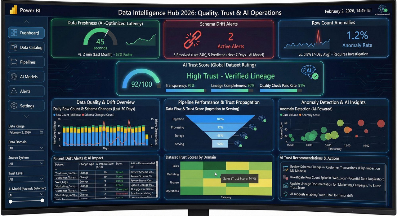
2. Data Analyst: Data Quality & Governance Hub
With Microsoft Fabric taking over, the Data Analyst role has effectively merged with data governance. You aren’t just analyzing sales; you are analyzing the trustworthiness of the data itself using advanced data quality monitoring.
-
Target Audience
Data Analysts, Data Engineers, CDOs.
-
Key Metrics (KPIs)
Data Freshness (Latency), Schema Drift Alerts, Row Count Anomalies.
-
The 2026 Edge
The “AI Trust Score.” This is a huge trend—rating your datasets based on lineage transparency so users know if they can trust the reporting metrics.
Example
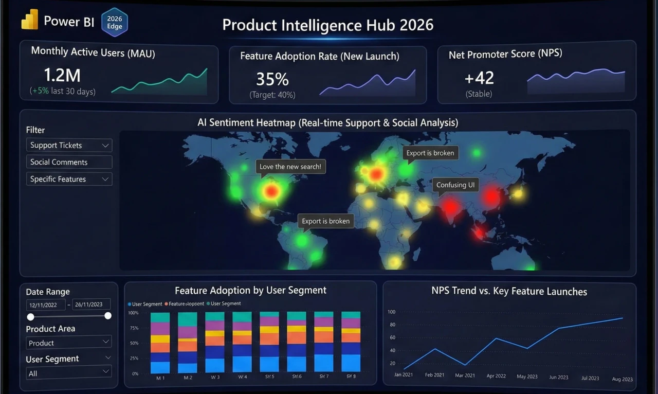
3. Product Manager: Lifecycle & User Sentiment 360
Product Managers have a tough job correlating what users do (telemetry) with what they say (feedback). This product analytics dashboard tries to bridge that gap
-
Target Audience
Product Managers, UX Researchers.
-
Key Metrics (KPIs)
Monthly Active Users (MAU), Feature Adoption Rate, Net Promoter Score (NPS).
-
The 2026 Edge
It’s all about the “Sentiment Heatmap.” Imagine AI analyzing support tickets and social comments via real-time streaming to show you exactly how users feel about that new feature launch.
Example
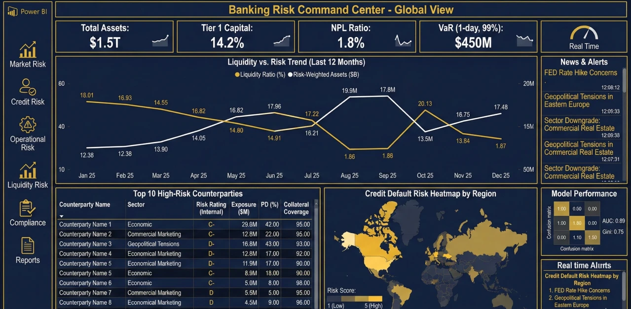
4. Banking: Liquidity & Credit Risk Monitor
In banking, speed is everything. You can’t wait for end-of-day reports to know your liquidity position. This dashboard is built for high-stakes, real-time financial monitoring.
-
Target Audience
Risk Managers, Treasury Officers.
-
Key Metrics (KPIs)
Liquidity Coverage Ratio (LCR), Non-Performing Loans (NPL) %, Value at Risk (VaR).
-
The 2026 Edge
Anomaly detection is the star here. It flags weird transaction patterns or liquidity dips instantly, acting like a digital smoke alarm for risk management.
Example
Related Reads
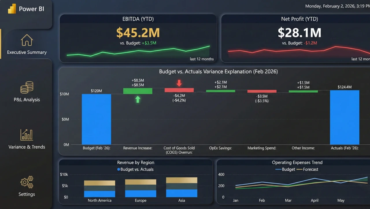
5. Finance: CFO Profitability & Forecasting
CFOs don’t just want to know where the money went; they want to know where it’s going. This executive financial dashboard moves beyond the standard P&L to handle complex scenario planning.
-
Target Audience
CFOs, Financial Controllers.
-
Key Metrics (KPIs)
EBITDA, Operating Cash Flow, Days Sales Outstanding (DSO).
-
The 2026 Edge
“What-If” parameters are essential in modern financial forecasting. The ability to slide a bar and simulate a 5% inflation hike to see the impact on net profit is a game-changer for executive meetings.
Example
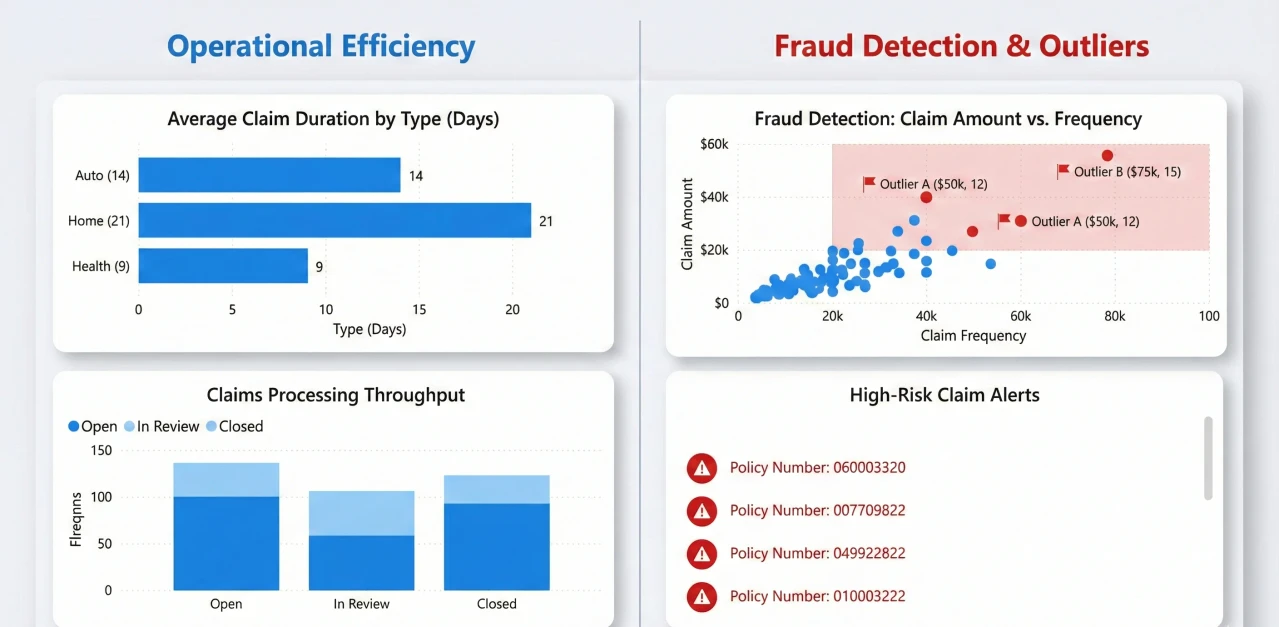
6. Insurance: Claims Processing & Fraud Detection
Efficiency here translates directly to the bottom line. This dashboard is designed to spot bottlenecks in the claims processing workflow and, more importantly, catch fraud before a check is cut.
-
Target Audience
Claims Managers, Actuaries.
-
Key Metrics (KPIs)
Average Cost Per Claim, Claims Settlement Ratio, Fraud Detection Rate.
-
The 2026 Edge
Decomposition trees are fantastic here. They let you break down “High Cost Claims” by any factor—region, agent, accident type—to find the root cause of a spike using AI-driven insights.
Example
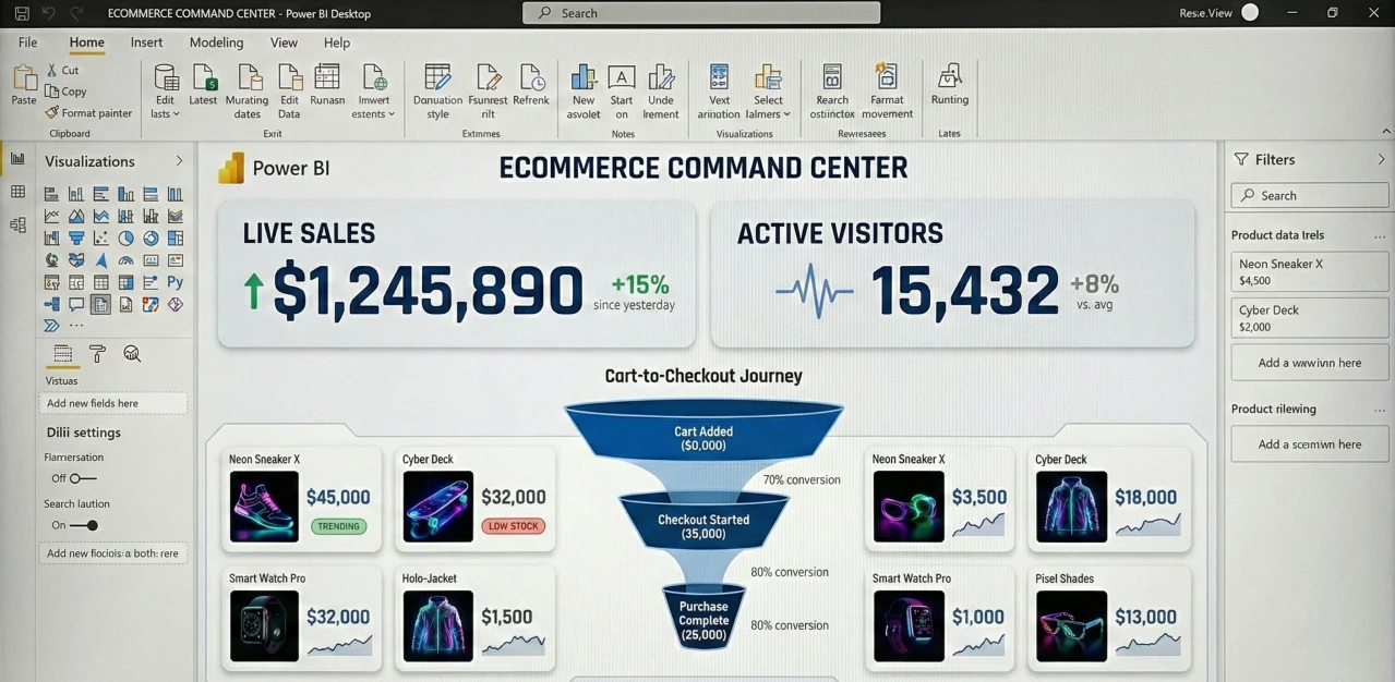
7. Ecommerce: Real-Time Sales & Cart Abandonment
For an Ecommerce manager, 24 hours is an eternity. During events like Black Friday, they need second-by-second updates via a live sales tracker.
-
Target Audience
Ecommerce Managers, Digital Marketers.
-
Key Metrics (KPIs)
Real-time Conversion Rate, Cart Abandonment Rate, Average Order Value (AOV).
-
The 2026 Edge
The “Live Cart Tracker.” It’s a funnel that updates live, showing you exactly where people are dropping off. It’s stressful to watch, but incredibly valuable for optimizing online revenue.
Example
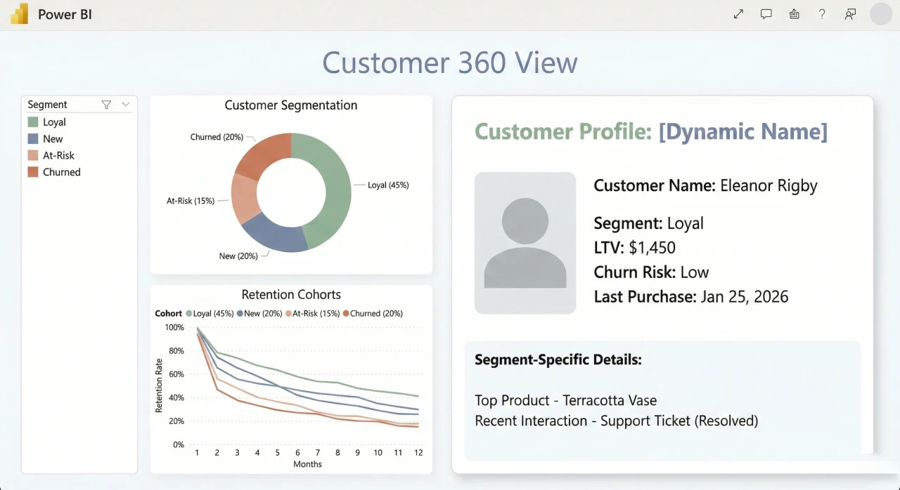
8. CRM: Customer 360 & Retention
We talk a lot about the “Customer Journey,” but visualizing it is hard. This CRM dashboard pulls from support, sales, and marketing to give a full picture of who your customer actually is.
-
Target Audience
CRM Managers, Customer Success Teams.
-
Key Metrics (KPIs)
Customer Lifetime Value (CLV), Churn Rate, Support Ticket Volume.
-
The 2026 Edge
Integrating external demographic data. It helps you segment customers not just by what they bought, but by who they are, allowing for much more personalized customer retention strategies.
Example
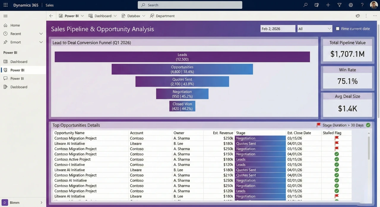
9. Dynamics 365 Sales: Pipeline Velocity
If you are in the Microsoft ecosystem, this is your bread and butter. But instead of just showing a list of open deals, this sales pipeline dashboard focuses on velocity—how fast are things moving?
-
Target Audience
Sales Directors, VP of Sales.
-
Key Metrics (KPIs)
Pipeline Velocity, Lead-to-Opportunity Ratio, Win Rate by Sales Rep.
-
The 2026 Edge
The “Stalled Deal” alert. It highlights opportunities that haven’t budged in 30 days, forcing the sales rep to either work it or close it out, ensuring better sales forecasting.
Example
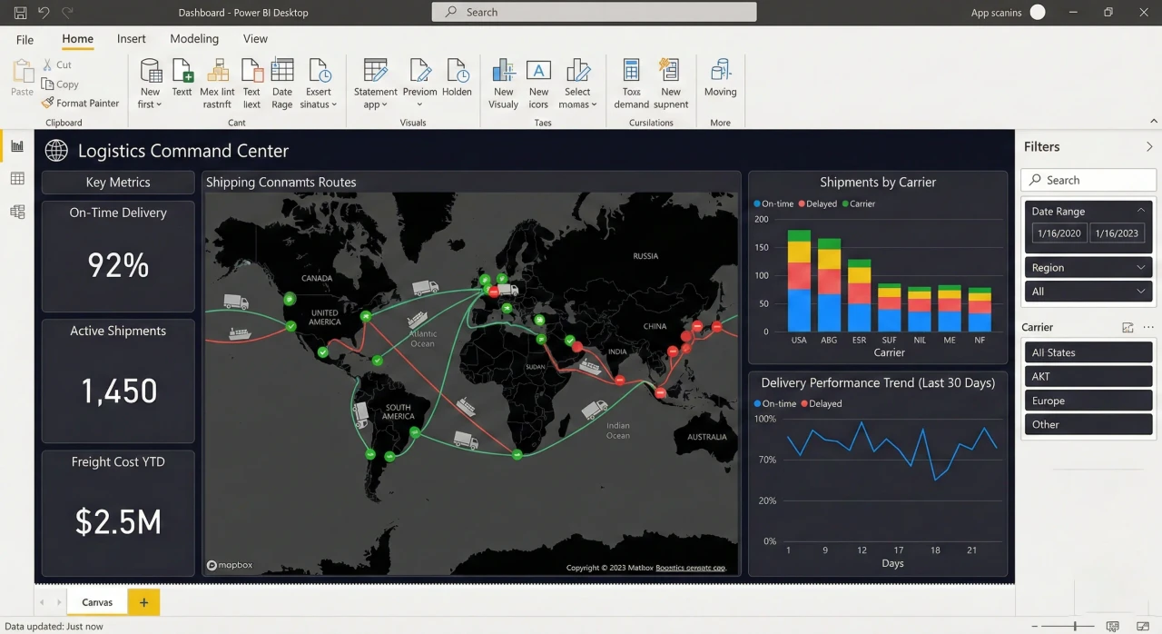
10. Supply Chain: Logistics Command Center
Supply chains have been chaotic lately. This supply chain analytics dashboard is all about visibility—tracking inventory as it moves across the globe.
-
Target Audience
Supply Chain Directors, Logistics Coordinators.
-
Key Metrics (KPIs)
On-Time In-Full (OTIF), Inventory Turnover Ratio, Supplier Risk Index.
-
The 2026 Edge
We are seeing Azure Maps layers being used to overlay live weather data on shipping routes. It helps you predict delays before the ship even hits the storm, a critical tool for logistics optimization.
Example
Best Practices for Power BI Design in 2026
If you want to master data visualization this year, remember that building the chart is the easy part. The real skill is in the design and dashboard development.
Always design for mobile first—your boss is checking these numbers on their phone between meetings. Optimize your DAX queries because nobody waits more than two seconds for a report to load anymore. And please, keep accessibility in mind. Use high-contrast colors so everyone on your team can actually read the insights you worked so hard to uncover.
Conclusion
The world of business intelligence is moving fast. Whether you are analyzing financial risk or trying to optimize a global supply chain, the ability to build a compelling Power BI dashboard is what separates the data entry clerks from the strategic partners.
Take these dashboard examples, adapt them to your data, and start building things that actually drive decisions. That is the only way to stay competitive in this field.